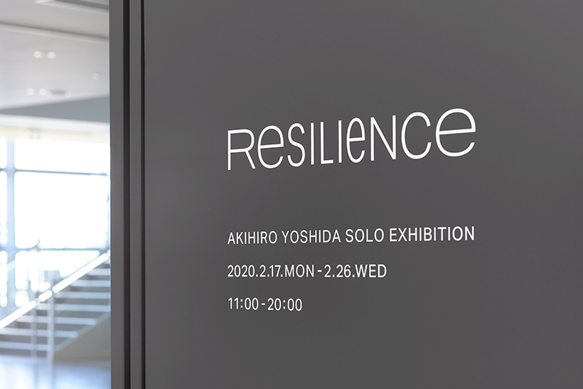
RESILIENCE
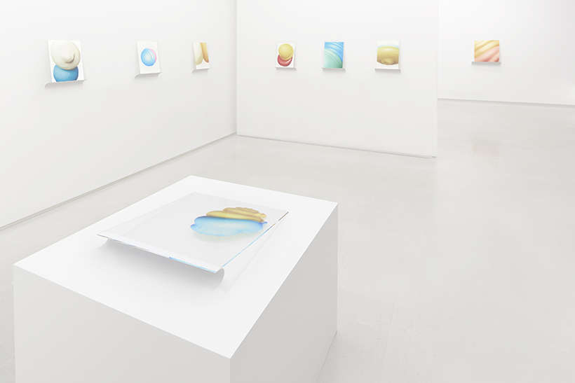
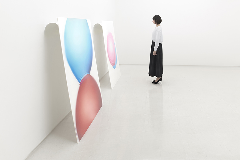
Spatial and graphic design of photographer Akihiro Yoshida’s private exhibition.
The exhibition design followed the theme of the exhibition, which was titled “RESILIENCE” from the elasticity and
recoil portrayed in the series of high-speed photography work capturing the aspect of water balloons at the moment of collision.
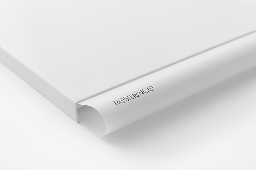
The logo was designed as though pressure applied from both ends of the text were compressing the center.
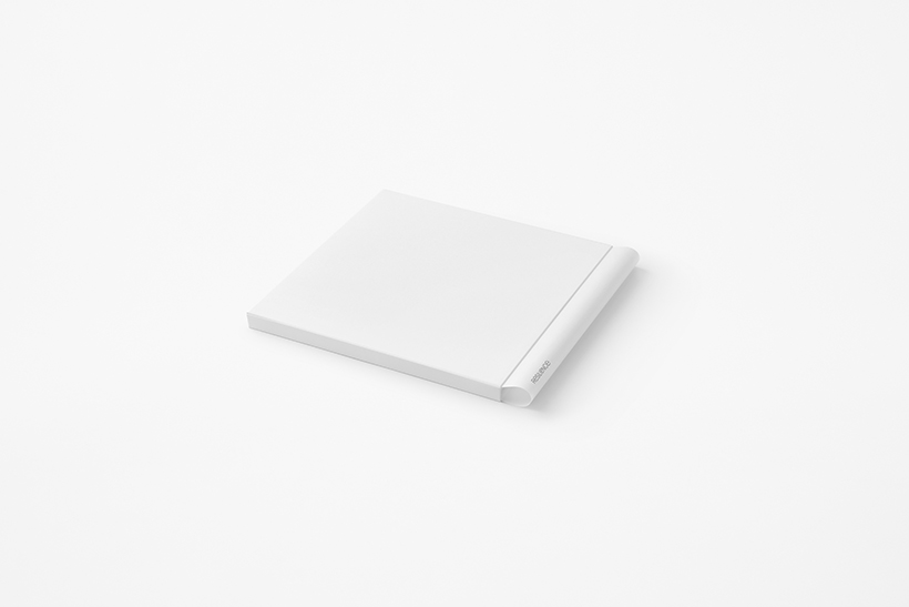
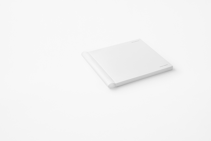
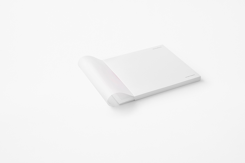
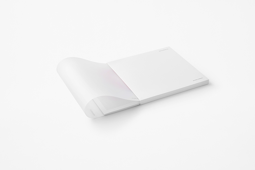
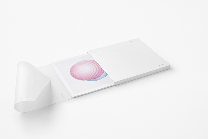
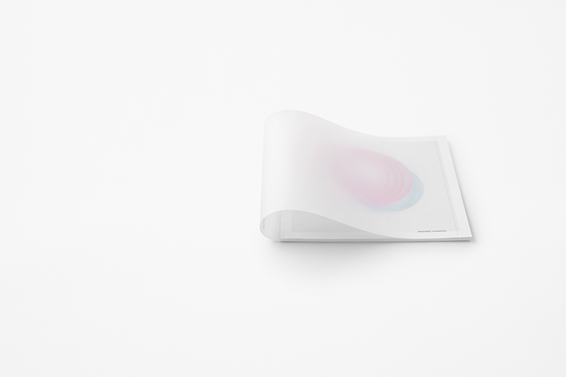
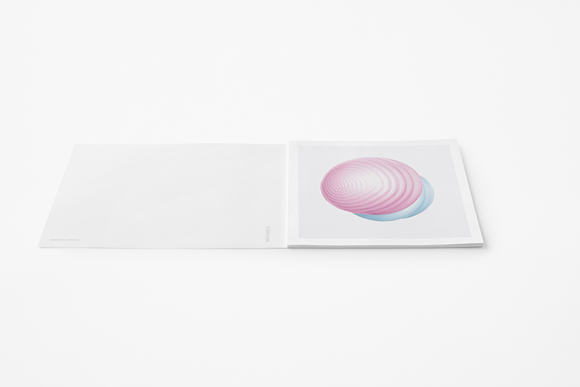
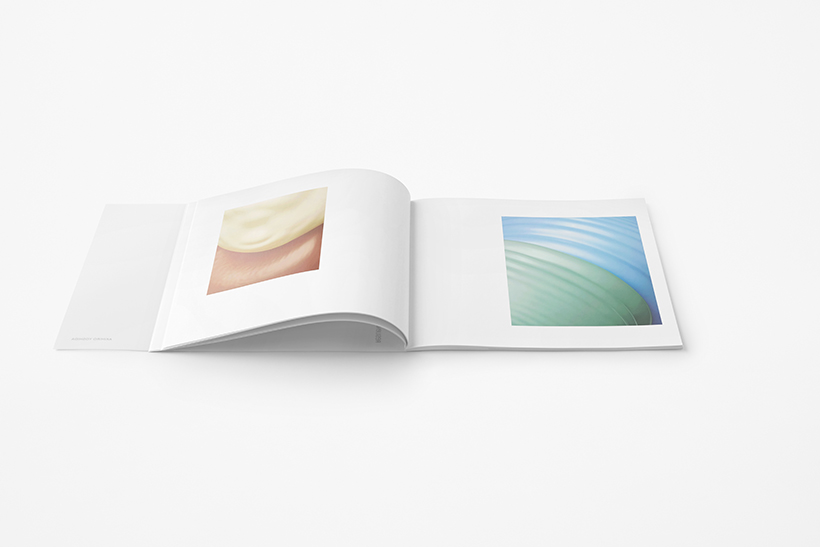
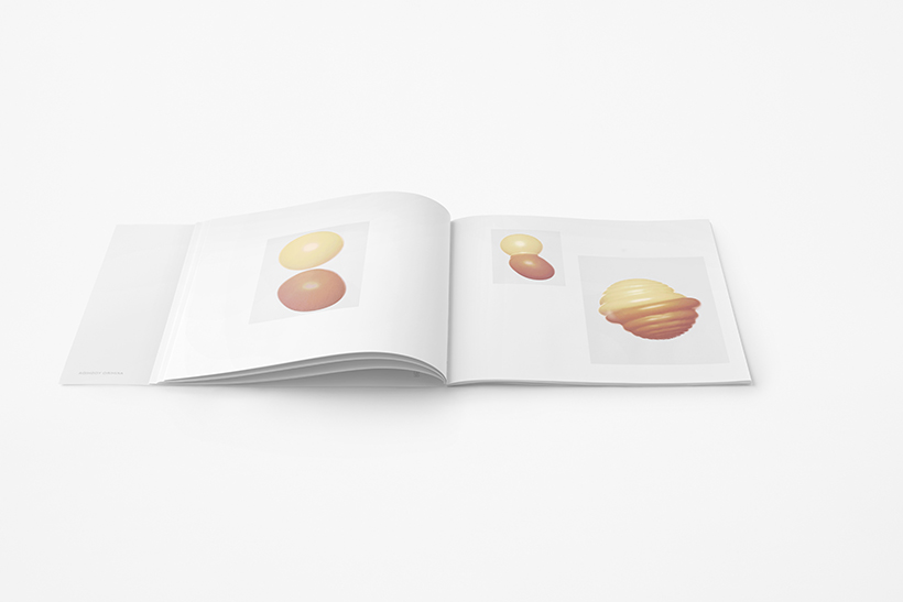
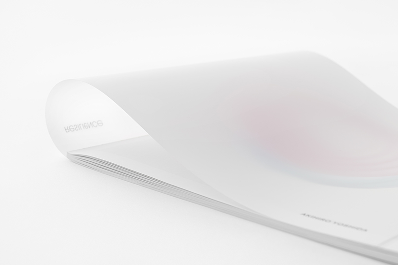
Next, a paper with high elasticity was chosen for the catalog cover and forced into the case to create a perpetual state of resilience inside the case, which resulted in producing a uniquely arched spine.
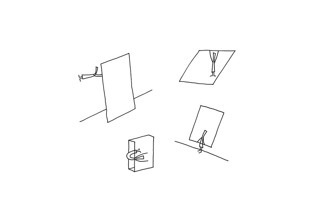
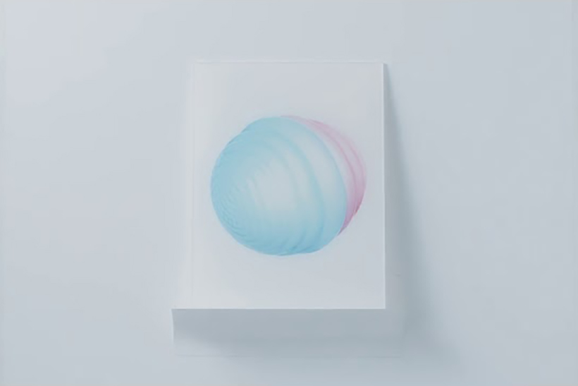
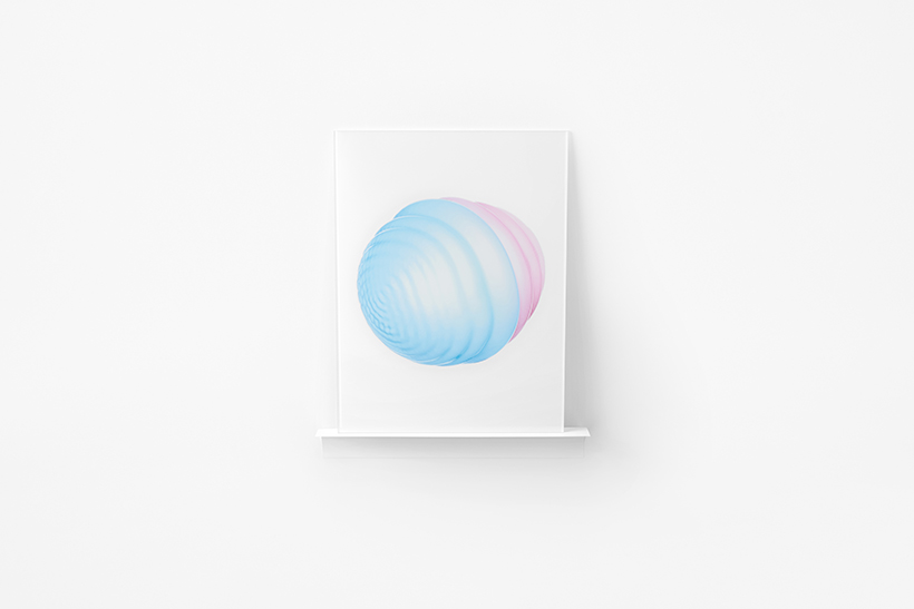
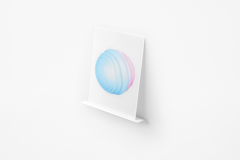
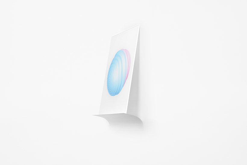
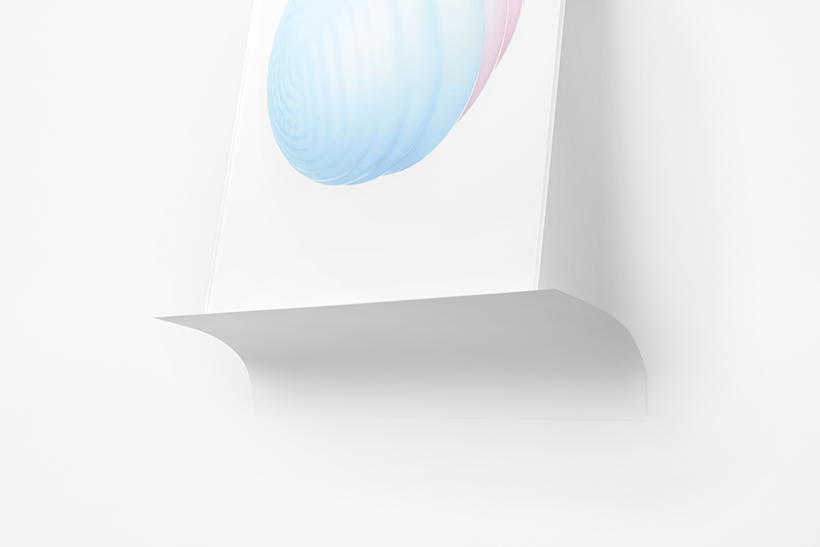
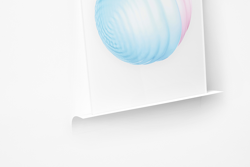
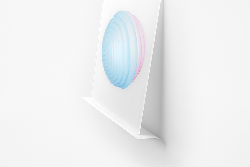
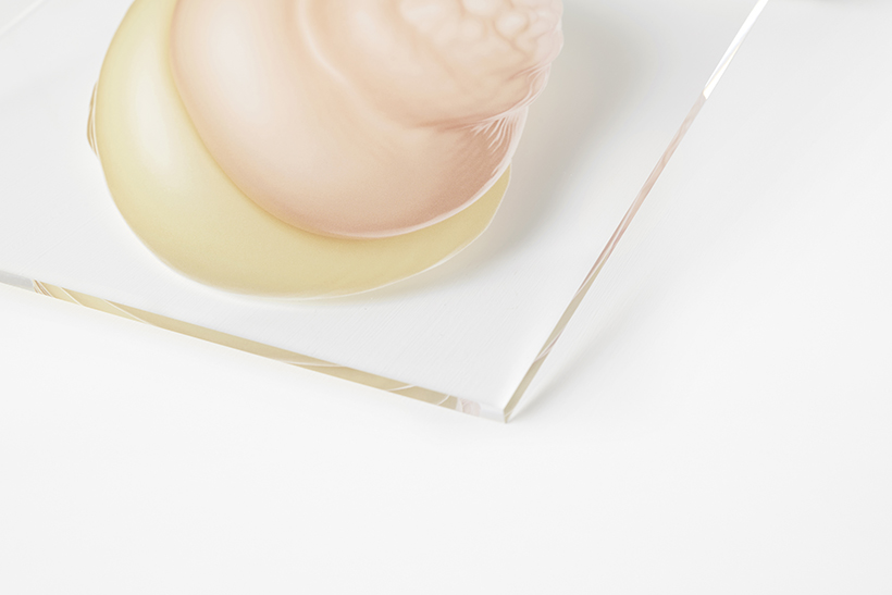
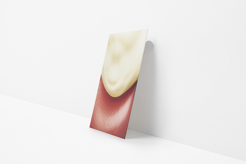
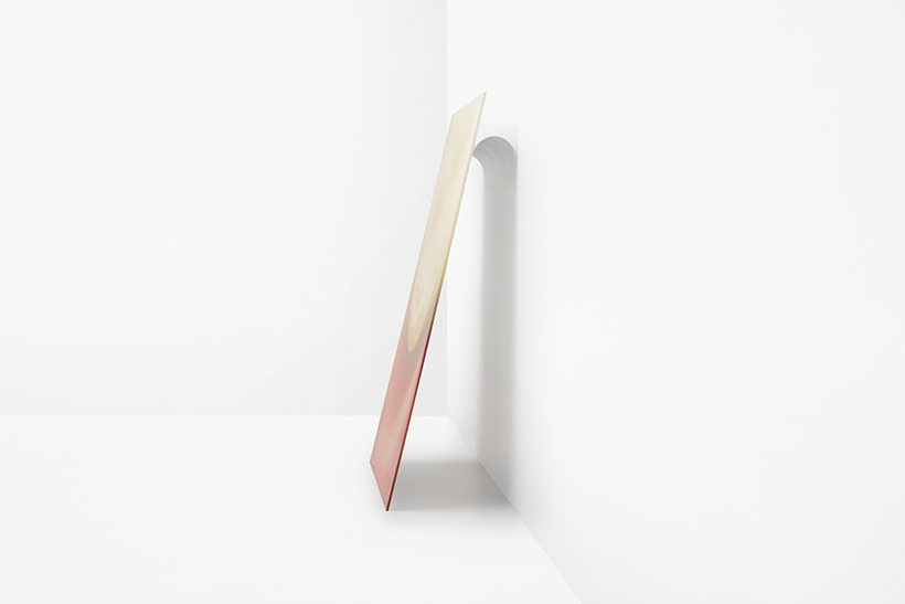
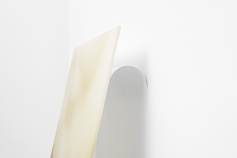
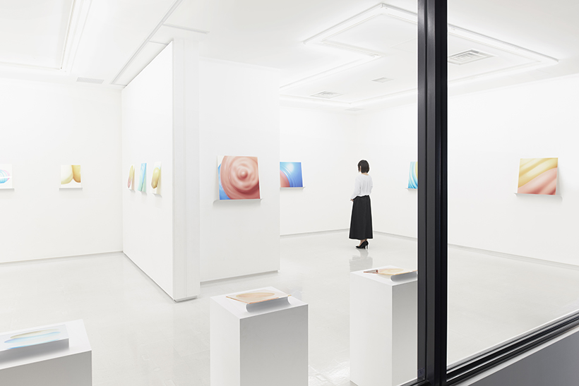
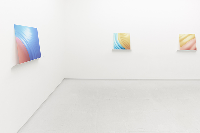
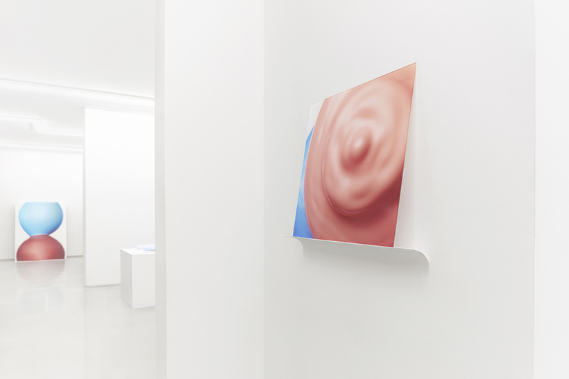
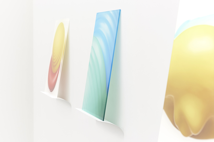
Because the exhibited works were high-resolution prints on acrylic panels, the pieces were displayed by supporting them with flexible and rebounding thin metal plates rather than by fixing them onto a surface such as framing, hanging from a picture rail, or wall mounting.
For works displayed on walls, a delicate balance was sought by adjusting the flex according to the weight of the pieces—using stainless steel plates 0.2 mm thick for smaller works, 0.3 mm thick for relatively larger works, and so on.
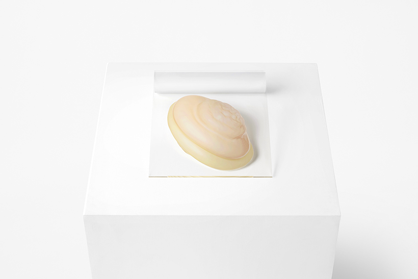
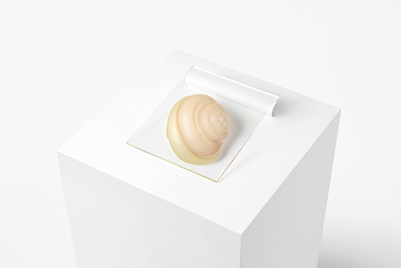
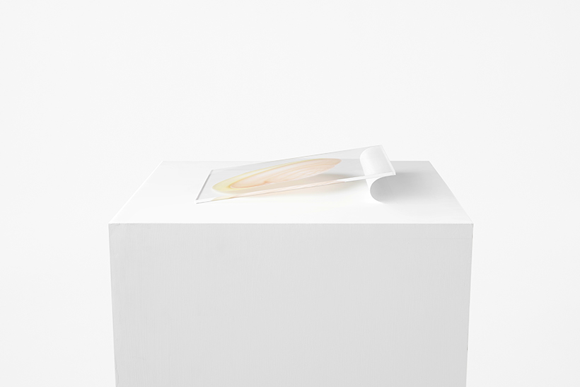
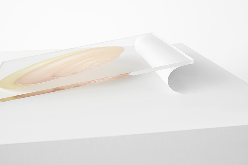
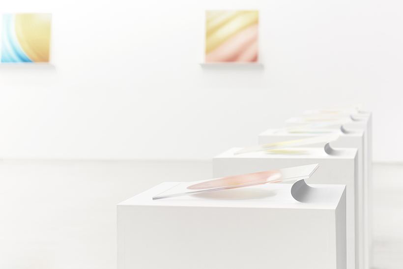
Further, works placed on exhibition stands were made to hover on one side by using 0.08 mm panels,
to cast shadows of water balloons and increase the sense of buoyancy.
When viewers move in front of each work, consequent vibrations and disturbances in the air make the pieces sway.
The designs were produced with the aim to enhance the essence of the works.
