nendo : the space in between
The first large-scale retrospective exhibition by nendo, held over a five month period at the Design Museum Holon, Israel. nendo’s designs begin by exploring and layering existing preconceptions, and then locating the gaps or “spaces” in between these layers to tie together new ideas. The idea behind this method is to gradually broaden the mind of the viewer. No less than 70 works divided into 6 categories of “spaces” were exhibited, with the aim of providing visitors with a first-hand experience of this process.
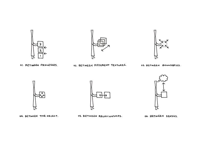
01 between processes
Reexamining existing manufacturing processes draws one’s attention to the spaces that exist between these sequential events. One can use these spaces to add a new process, omit an existing process, or change the order of processes. Or one can even replace an existing process with a completely different manufacturing process; the result is an entirely new perception of value.
02 between textures
Materials have their own distinct characteristics. These can be varied, from physical traits to qualitative properties of their feel or expression. If one takes a closer look at the gaps between two differing materials, it becomes apparent that there are no clear-cut distinctions, but rather a gradated space in which their respective characteristic features waver ambiguously. It is this space that forms a platform for new ideas and creativity.
03 between boundaries
There is a multitude of interactions in everyday life; Between people and things, things and spaces, the inner and the outer, the self and the other. Blurring, erasing, or slightly shifting the lines between these boundaries can challenge and loosen our preconceptions, giving rise to new spaces.
04 between the object
There are also plenty of gaps or spaces within things. Widening, truncating, or replacing these gaps with completely different elements can bring about new functions and meanings from the inside. If there are no discernible spaces, then shifting something ever so slightly can create a similar effect. The ‘layering’ and ‘depth’ of these respective elements, brought about by the use of a series of spaces, can also be of great interest to us.
05 between relationships
Whether they are top-down or locational, multiple elements are inevitably bound by some kind of relationship that holds them in balance. Breaking such a state of equilibrium can create spaces between existing relationships, and thereby reconstruct them. Connecting things that are initially separate. Layering things that are initially adjacent to each other. Inversing the relationship of structure and finish, or of design and function. Creating alternate relationships and states of balance in this way can lead to new and invaluable discoveries.
06 between senses
Transferring the invisible senses such as sound, taste, smell, and time into physical form allows more people to register them at one time. This also involves exploring the spaces between two differing senses, such as visual and aural, or visual and sense of taste. Such designs allow viewers to translate their visual perceptions into a different sensory perception, thereby creating a feeling of satisfaction not unlike when one solves a puzzle or quiz.
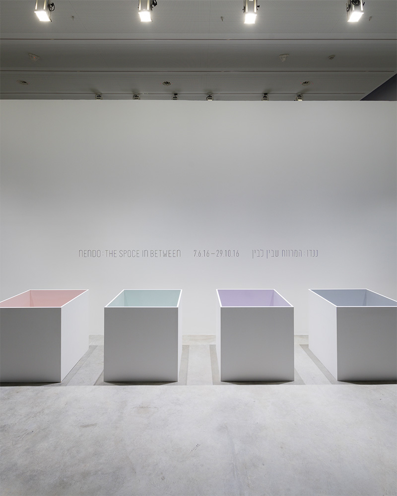
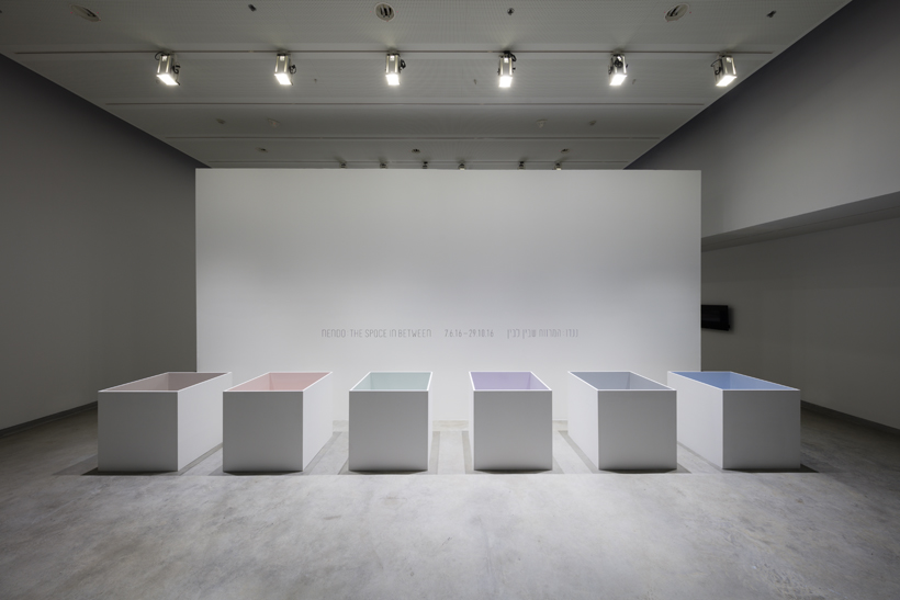
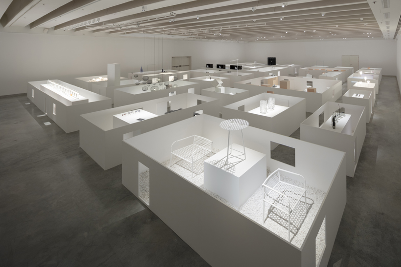
The exhibition was not to be an open space and neither divided by floor to ceiling walls. Instead it was decided that the pieces are to be displayed using 900mm high wall. This allowed the openness of space while also ensuring a display method to highlight the design perspective of each piece, and maintaining security and safety at the same time. The appearance of the “part of the top” of the pieces appearing and disappearing and the people trying to peak over the wall resembles a “zoo” like experience, which gives a moderate sense of a distance between the people and the pieces. When viewing from the entrance of the gallery the inside of the wall is uniformly white, and yet when viewing from the opposite side one realizes that it is different colors in response to the 6 themes. This ensures that although the pieces are placed in a seemingly chaotic position, the theme that the pieces belong to can be identified. A dedicated app can be downloaded at the reception desk with 28 different animation videos that display the concept of the pieces can be viewed using one’s smartphone by standing close to the piece. Inside the enclosure is paved with white pebbles which hide the wiring. The pebbles also serve as a “weight” for the wall, and by providing small windows on the wall, the pieces can be enjoyed from different angles. Owing to the pebbles and windows the inside of the enclosure enabled the viewers to feel they are seeing a “garden” or a “house”. This resulted in a space composition that gives a feeling that it is a small “town” where people can walk around freely within the space in between, and sit and relax in the several areas that look like “public squares”.
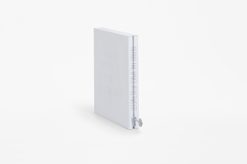
The books of this exhibition comprise two separate parts; one of text and one of pictures. They were designed so as to form a small gap or “space” when placed together in their accompanying case.A small device holds the two books together when inserted into this gap, and purchasers can choose one from 6 designs (6 also being the number of categories in this exhibition); a faucet, a flower, a key, a zip, a door, and a saw. Also, the book title is printed between the spines of the two books, so as to give the visual effect of the letters being stretched out along the stripes on the sides of the book when pulled out from the case, and also to let the reader know instinctively that these two books are meant to be combined into one. As such, it is indeed a design that plays with the concept of “spaces” to the very end.
