0ΔД
With a history of over one hundred years, Kanro has manufactured and distributed a wide variety of candy and gummies. The recent establishment of the manufacturing method of foamed gummy—which contains small bubbles from an air mixing process to have a soft, light texture—called for a newly designed gummy shape and packaging.
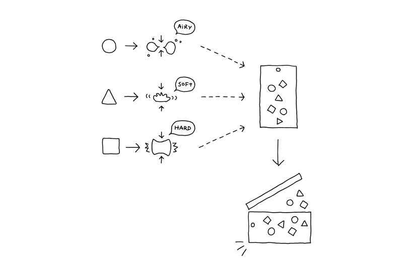
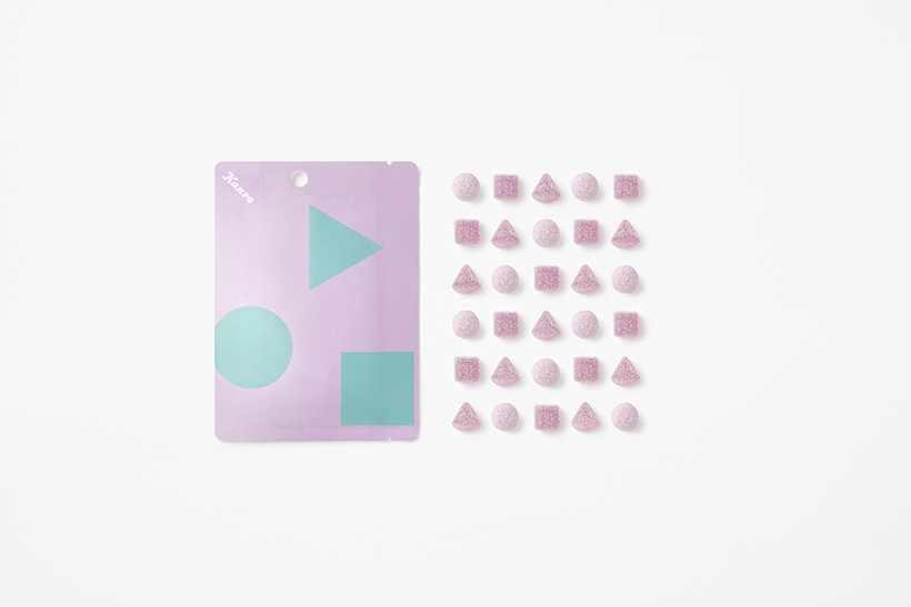
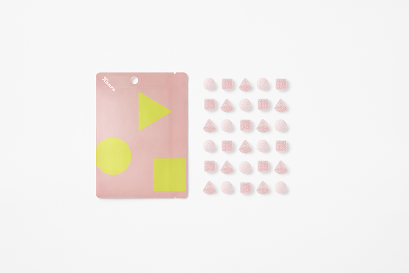
Foamed gummies’ characteristics are better experienced by comparing their texture to other types of gummies rather than eating them alone, and it was with this focus that the chewier, hard gummies would come to be sold in the same package and mixed in with the soft gummies Kanro excels at manufacturing.
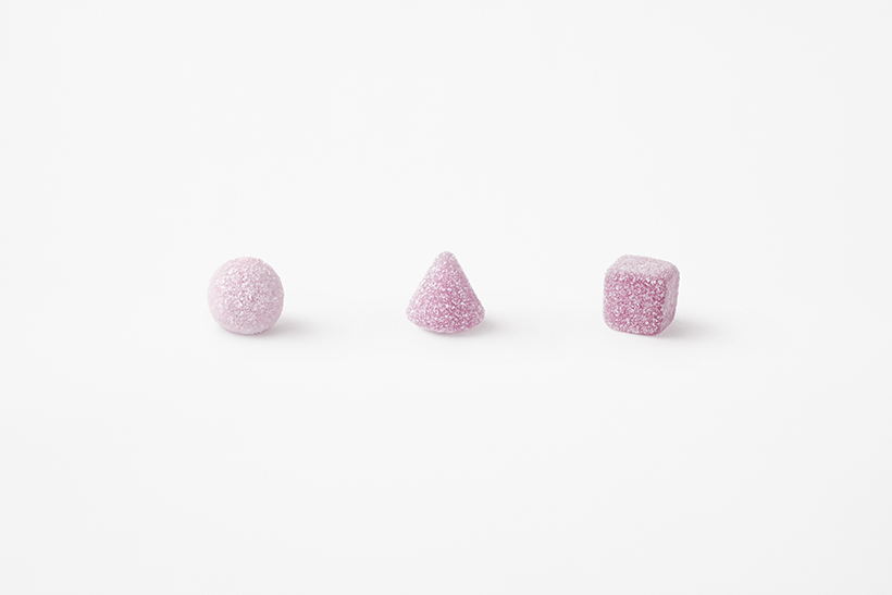
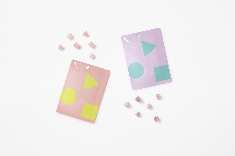
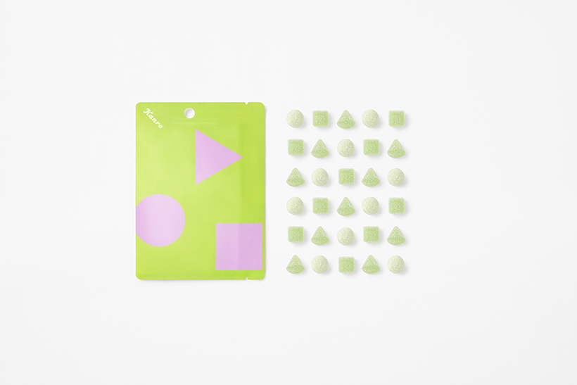
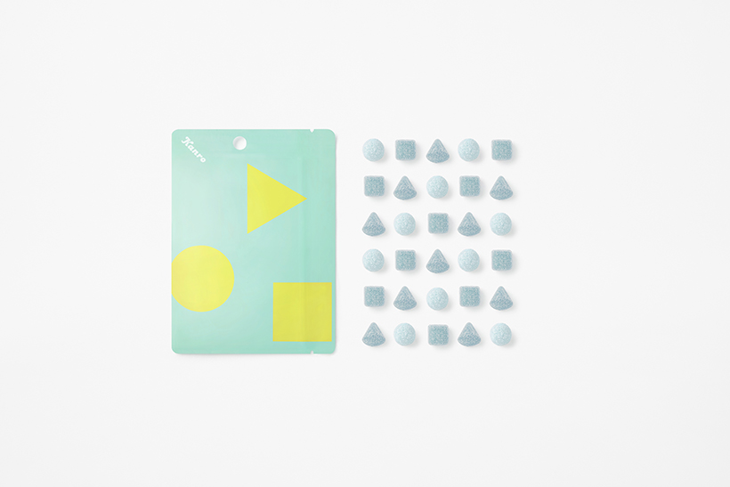
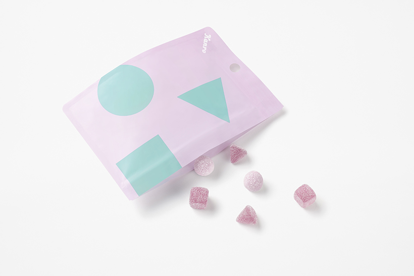
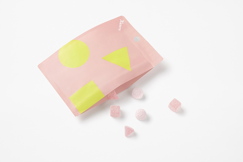
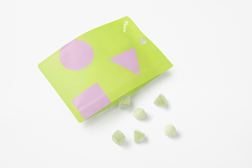
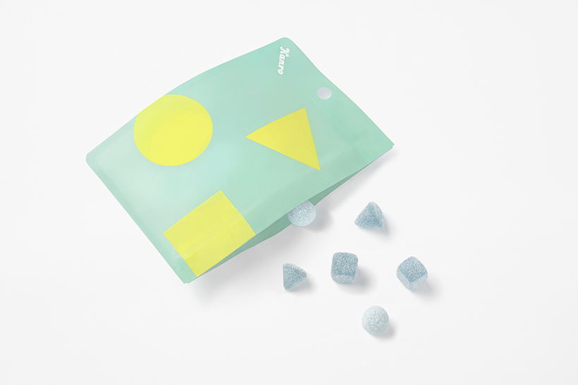
To emphasize each gummy’s texture, the hard gummies were designed as cubes with a large contact area and volume to withstand the compressive force of a bite. Soft gummies are conical with a small contact area to better feel the satisfaction of biting into its gooey texture. To best demonstrate the fluffiest gummy of all, the foamed gummies come in a spherical shape that envelopes the teeth biting into them. All three are intentionally flavored uniformly. Numerous products on the market mix different flavors of gummies in the same package, but presenting different textures with the same taste brings the company’s superior technological capabilities to the forefront.
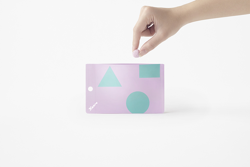
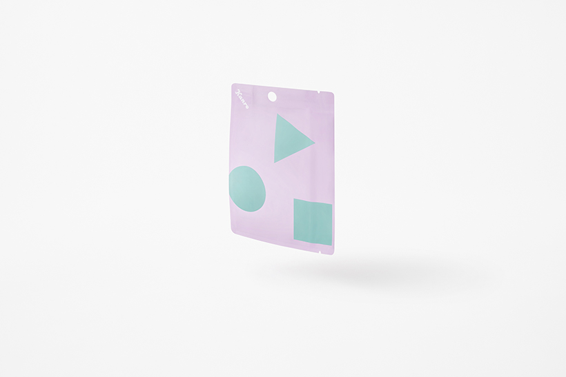
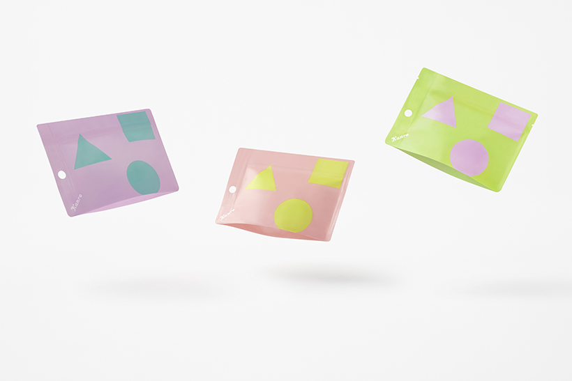
While the package is a standard pouch, the ziplock closure was moved to the side rather than at the top of the package. It was designed to be hung up on retail display hooks vertically so as to take up less space. The wider opening and shallower pouch style makes it easier to take gummies out once opened. Further, the reverse side of the pouch was made to stand upright in anticipation of the possibility the pouch would be laid on its side upon a table or surface. Its low height and wide base add stability in such a state, making it easy to store upright in an office drawer or place where its contents can be shared.
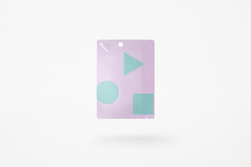
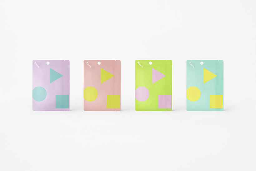
On the face of the package are just the shapes of the three gummies, circle, triangle, and square, and the Kanro logo, tilted 45 degrees so as to be read easily whether vertically on display at the store or placed horizontally for eating.
