Escher X nendo | Between Two Worlds
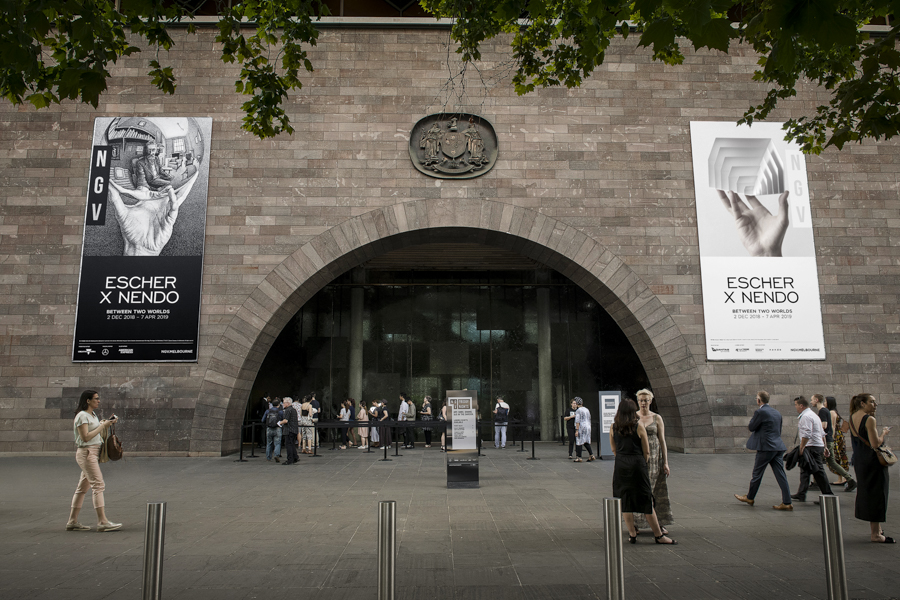
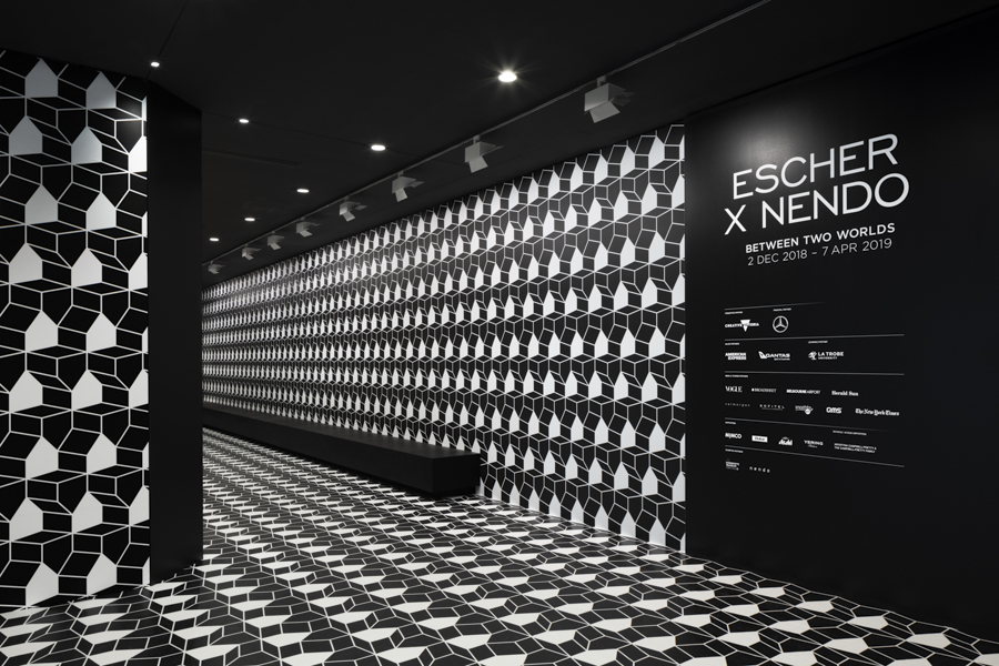
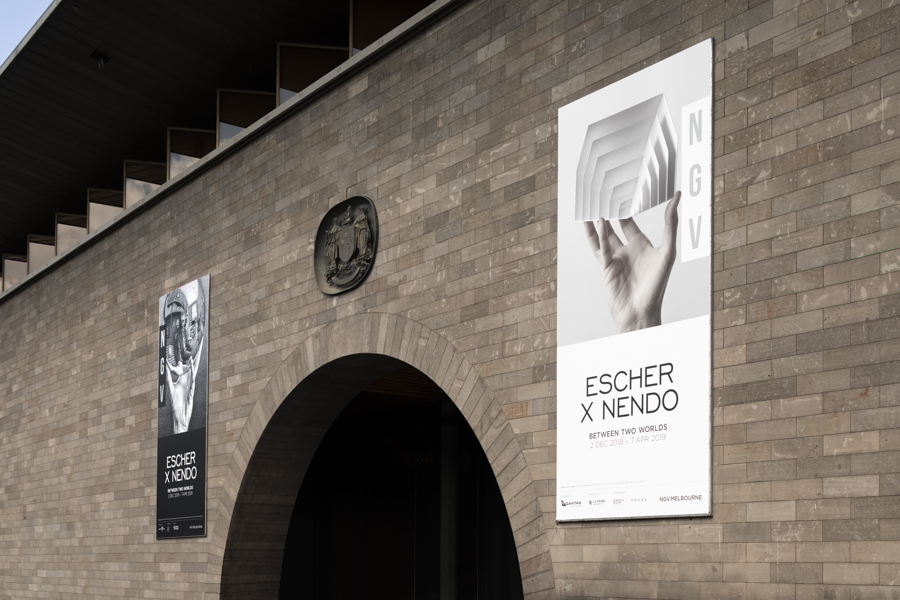
A collaborative exhibition between Dutch graphic artist M.C. Escher (1898-1972) and nendo held for four months at the National Gallery of Victoria(NGV) in Melbourne, Australia.
The exhibition featured 157 of Escher’s works, renowned for his use of optical illusions executed with a seemingly mathematical approach, together with space and objects created by nendo and inspired by Escher’s works. The project was commissioned by NGV and executed with the full support and cooperation of Gemeentemuseum Den Haag and the M.C. Escher Foundation.
This collaborative exhibition follows the previous Andy Warhol x Ai Weiwei collaboration held at the museum in 2015.
At First, the curatorial division of Escher’s work into categories was carefully discussed with the NGV team.
It was settled to tell the story of the exhibition, rather than chronologically, in a manner that expresses Escher’s thematic interests and techniques, therefore reflecting the artist’s ideas and point of view.
Each category is displayed in a separate gallery space, dedicated and designed to fit the content it inhabits. The museum’s original structure of 4 main galleries was carefully divided into 10 spaces that vary in scale and atmosphere to create one continuous labyrinth-like experience.
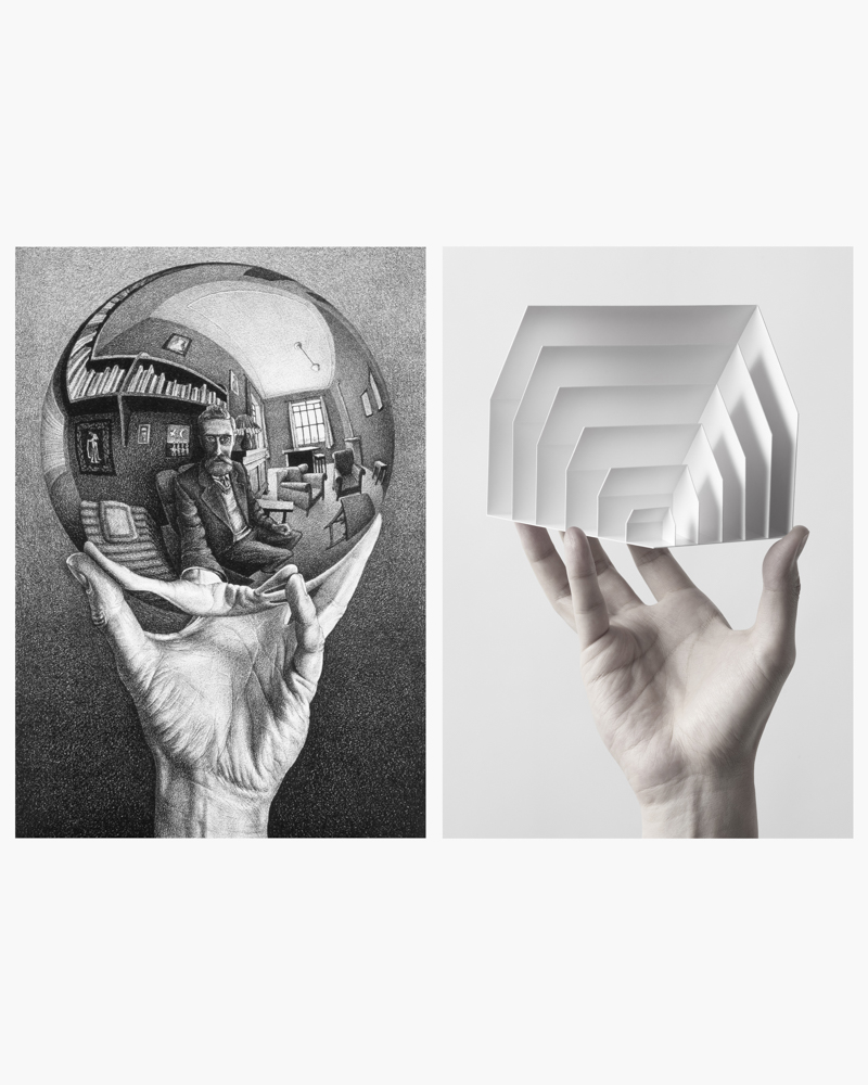
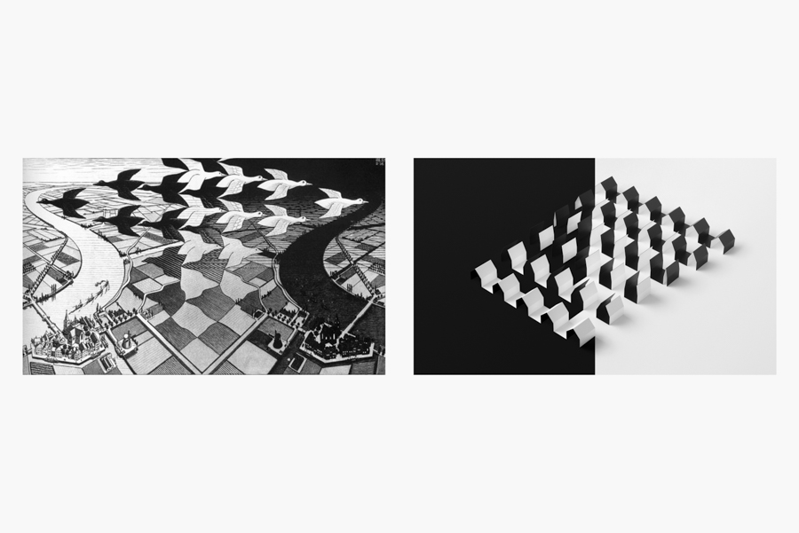
Fish, birds, and other characters frequently appearing in Escher’s works as guides to communicate his complex ideas, have inspired the decision to choose a three-dimensional motif to navigate people throughout the exhibition.
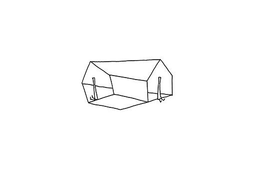
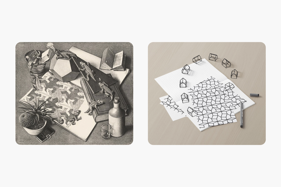
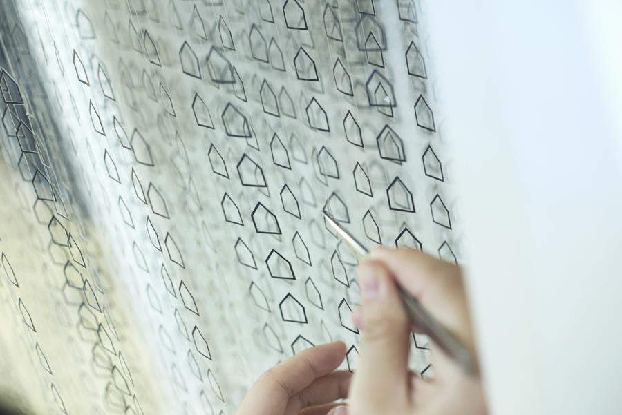
Born from the idea to design a “home for Escher” and considered as a symbol of space, the simple shape of a house was chosen to convey the concepts of the exhibition.
The fact that Escher investigated three-dimensional expressions and ideas in two-dimensional techniques, has encouraged the exhibition design to explore the opposite.
Therefore the space was designed as a site-specific immersive experience, maintaining a strong two-dimensional appearance expressed in three-dimensional installations and objects.
To further highlight the graphic quality of the exhibition, only black, white and grey were used as colors, accentuating important details with lights, shadows and reflections.
01 the form of a house
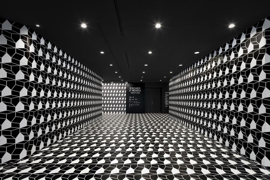
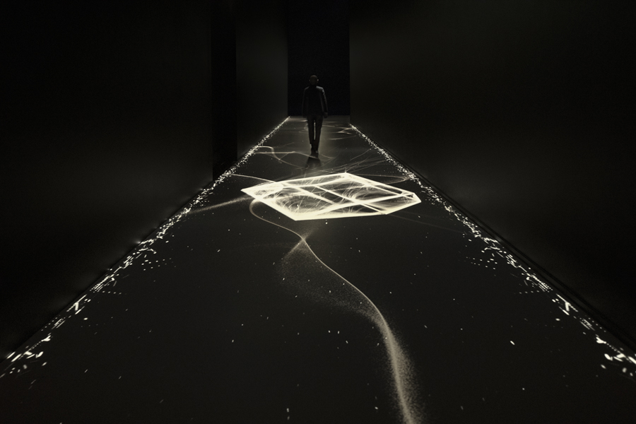
The floor of the 17 meter long corridor at the entrance of the exhibition was illuminated with a floor-projected animation.
Similar to sand in an hourglass, clouds of small particles flow in space, forming shapes and leading the visitors into the first gallery.
Like the evolution of an idea, the small sparks gradually construct lines, which then become surfaces that eventually create the shape of the house motif.
02 arising house
The first gallery of the exhibition shows Escher’s early and less familiar works executed in the beginning of his career.
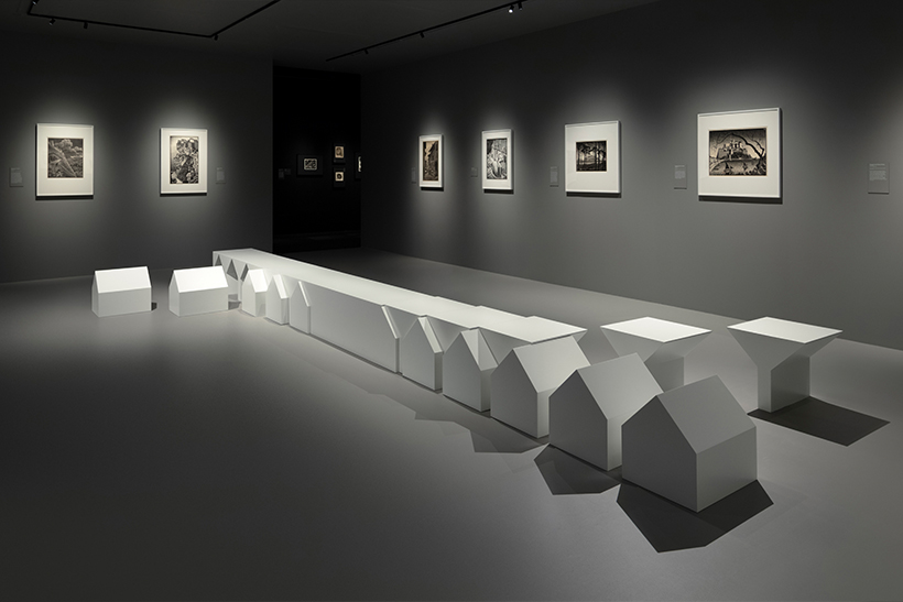
A long white bench placed in the middle of a seemingly modest gallery space allows visitors to linger in front of the detailed prints. To express the idea of Escher’s formative years and the process of finding his style as an artist, knee-high house shapes gradually emerge out of the rectangular bench. In a closer look it becomes apparent that on one side of the bench the houses are sliding out, while on the other side, the negative shapes of the house are shifting outwards and by so revealing the houses left behind. Both sides of the bench as well as its front and back are inverted and mirrored to fully render the concept of Escher’s early career.
03 reflection house
The category showcasing Escher’s investigation of reflections and refractions was presented in a symmetrically designed space.
A dark and subtle house pattern in three different scales was placed on the floor of the gallery, accentuating the symmetry by its layout mirroring in the centre line of the room.
The presentation of artworks in this space was also effected by the theme, best displayed in the presentation of “Eye” 1946 and its study work, that were placed adjacent to each other since they are the counter sides.
By doing so, it is almost as Escher is looking back on the visitors. Three artworks that present reflections in water and puddles were placed horizontally inside a display case, rather than on the wall, so that they can be seen by the visitors as Escher have imagined them.
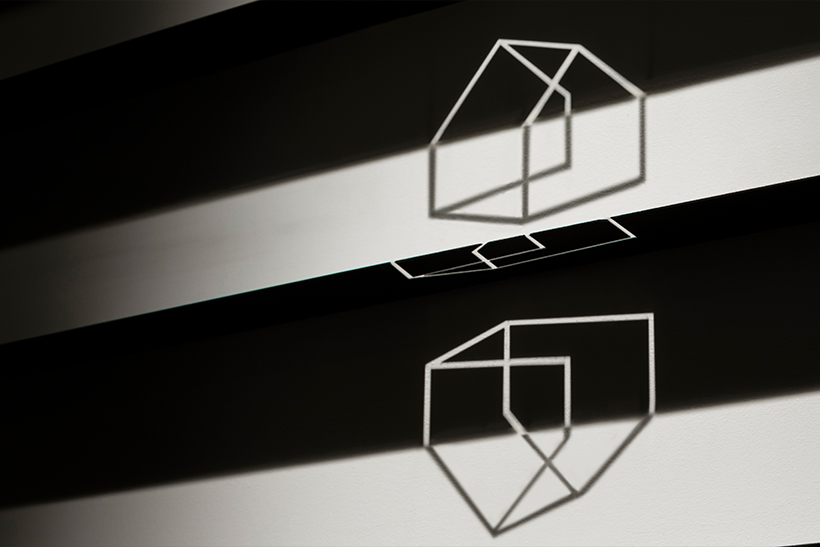
In the final section of the gallery a display of wall-mounted mirrored shelves have been cut out with a pattern, and when lit from a specific angle create an image of rotating houses on the wall.
The mirrored material reflects light back to the wall above it, while at the same time casts a shadow underneath. It is a new dimension formed in the meeting point between light and shadow.
04 transforming house
The largest gallery shows Escher’s research around the subject of “regular division of the plane”.
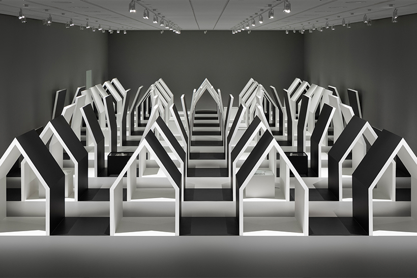
After climbing a staircase to a height of 3 meters above ground level, there is a gallery area that also serve as a viewing deck, from which the visitors can look down to the 60 meter long and 6-meter high gallery, displaying the largest house installation of the exhibition.
Four black exterior houses, as if turned inside-out, gradually open their roofs until the aisles between them are becoming houses themselves, resulting in a row of five white houses.
Slowly descending through a gentle slope, the visitors gradually change their perspective until they can walk freely between the houses and experience the space while discovering 17 artworks placed sporadically throughout the structures.
Most of the pieces presented in this area can be viewed in 360 degrees, therefore they were placed horizontally in display cases hidden in houses or between them.
When the visitors move along this space, they walk “inside” of black exterior and white interior houses, but suddenly would find themselves walking on the “outside” of white exterior and black interior houses; a transition that is reminiscent of the more elaborated regular plane divisions.
Moreover, when the visitors view this installation from the higher viewing point, the houses seem like a two-dimensional plane division, however when changing their point of view and walking through them, it is as if they are walking into an artwork and inside of Escher’s mind.
05 house in perspective
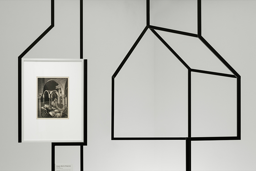
16 works that focus on extreme perspectives and the paradox of optical illusions, have inspired the design of this gallery.
Within a white exhibition space, black vertical metal pipes that are partially bent are placed in a random forest-like layout. Escher’s artworks are scattered and mounted on the same structures among the others, appearing to be floating in the space.
When viewed from a specific perspective, a group of black pipes visually overlap and create a house shape motif.
06 zooming house
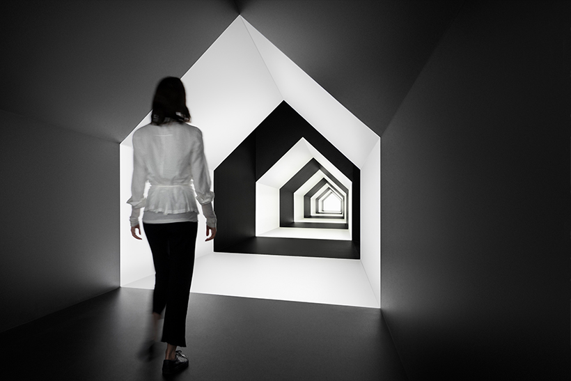
A 21 meter-long house-shaped corridor is placed in a connecting pathway between two galleries.
The entrance height is almost 4 meters, while the back edge of this element is only 50 centimetres, which emphasises the perspective when viewed from the front.
The internal colours are alternating between black and white and the painted areas grow smaller and smaller until reaching the light at the end.
The rhythm and perspective of this pathway excite visitors while they cross it and leads them to the doorway of the next room, camouflage as a black segment in this long house corridor.
07 house of movement
The six artworks that deal with the subject of geometrical beauty, like the work “order and chaos” 1950, present Escher’s love for crystals and platonic solids.
This raise ideas about the beauty that can be found in natural phenomenons such as molecular configurations and the existence of gravity.
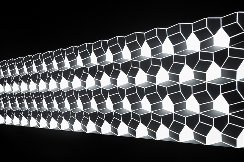
To best explore these concepts a three-dimensional house pattern base was made out of a thin metal sheet. A projected animation mapped directly on this tiled relief, expresses a state of flux between two-dimension and three-dimension.
08 gathered house
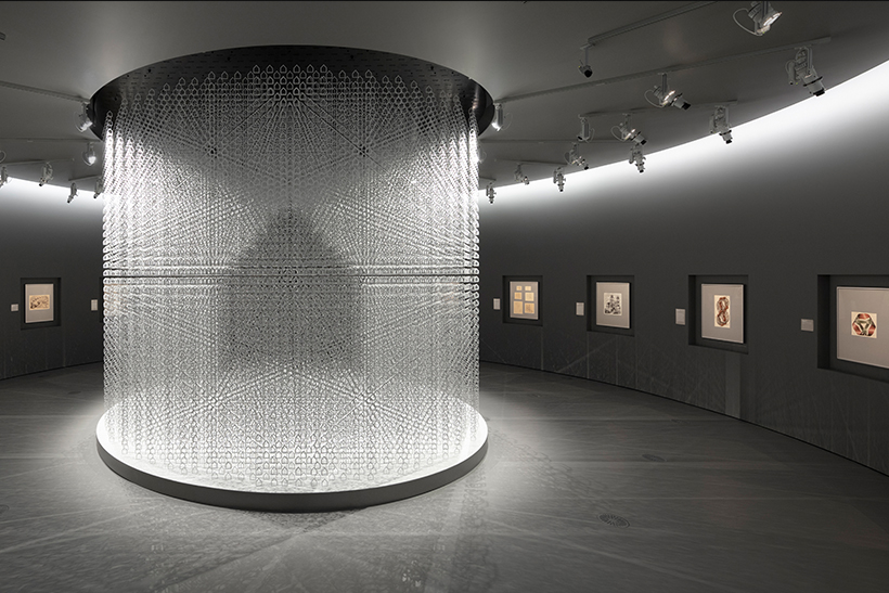
A round room designed to hold 17 of Escher’s famous artworks that embody many of the themes presented in the exhibition such as: reflections, tessellations, extreme perspectives and geometrical forms — interacting with each other in a circular, endless investigation of the infinity. In the centre of the round space suspends from the ceiling a 5 meter in diameter chandelier object.
Made of more than 55,000 small flat black and white houses, the chandelier reveals in its centre a floating large shadow-like house, which is made from a change in the colour of the houses.
When visitors walk around to the back of the installation, white and black are reversed and the floating house appear again.
The visitors need to walk around the exhibition space in its entirety to capture a complete impression of this object, accentuating the feeling of the infinite loop presented in the Escher’s works.
09 snake house
A gallery space dedicated completely to Escher’s last print before his death, Snakes (1969).
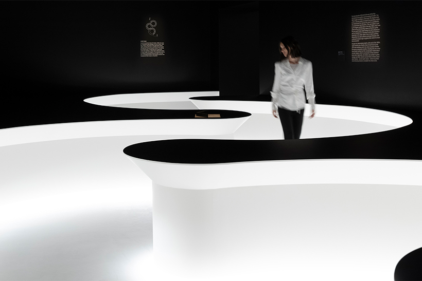
A white serpentined path was cut out of a black room with an 80 centimetres raised floor. The edges of the walls of the path are tilting inwards, appearing as if this path is also a result of an extruded house shaped pathway.
Inspired by the mathematical accuracy of the artwork, the curves of the path are based on even angles and tangency following the carefully calculated principle of Escher’s work. In the middle of the path, the study work is displayed showing the process of Escher’s production in only 1/3 of the finished print.
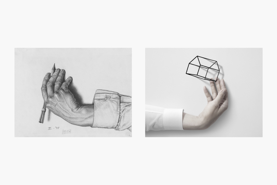
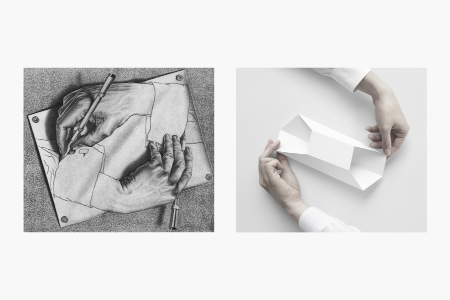
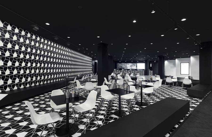
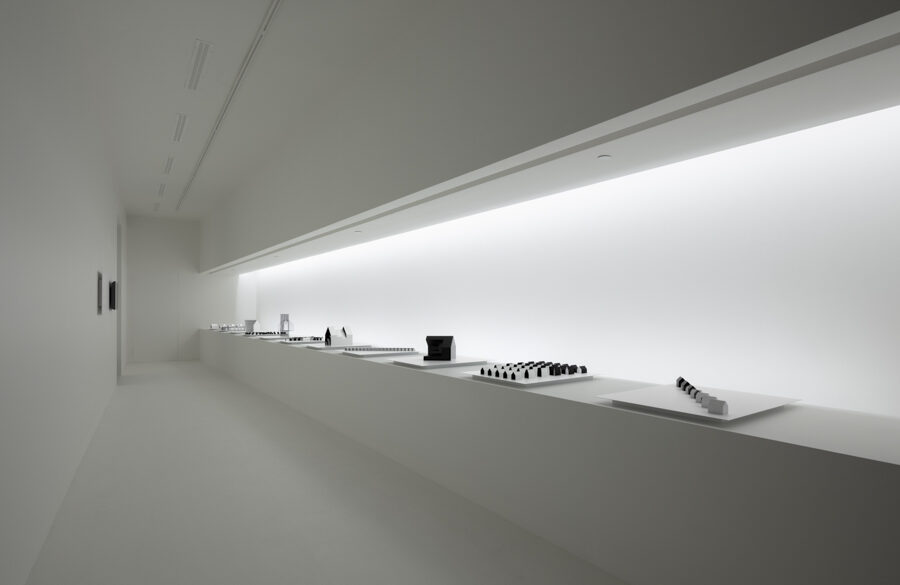
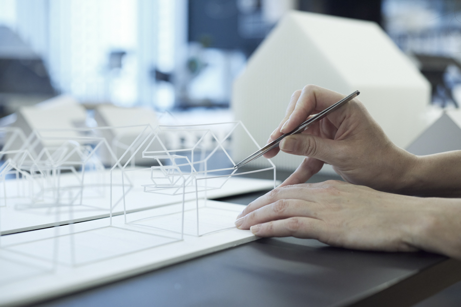
To best showcase the artist’s point of view – two mirrors with a 120° angle between them were placed above the vitrine , reflecting the work and making it appear whole. At the end of the path, the famous “snakes” work is displayed in the a central case, as it can be viewed from any angle. The nine spaces tell one continuous story. The first artwork on display in this exhibition is Study for Drawing Hands 1948, which depicts a single hand; the final work on display, Drawing Hands (1948), show two hands drawing each other. The two pieces which function as the bookends clearly bring out the exhibition’s concept. There are a café and a gallery at the entrance and the exit of the exhibition space. The café was decorated with house-motif graphics, with the multiple houses facing different directions. In the final space before leaving the exhibition, 11 objects based on the numerous paper mockups that were made during the design process were on display and are a new addition to NGV’s permanent collection.
