docomo shop + d garden
A proof-of-concept for the new designs of docomo shops, the dealerships of NTT docomo, Japan’s largest mobile phone operator.
With the increasing adoption of smartphones, docomo’s business model has shifted from selling smartphones and acquiring new subscribers to figuring out how subscribers can use smartphones they already have, more comfortably and frequently.
In addition to making more procedures available online, docomo shops have introduced a reservation system for customers and have been reviewing the optimal size of device display areas, waiting areas, and counters where customers fill out paperwork.
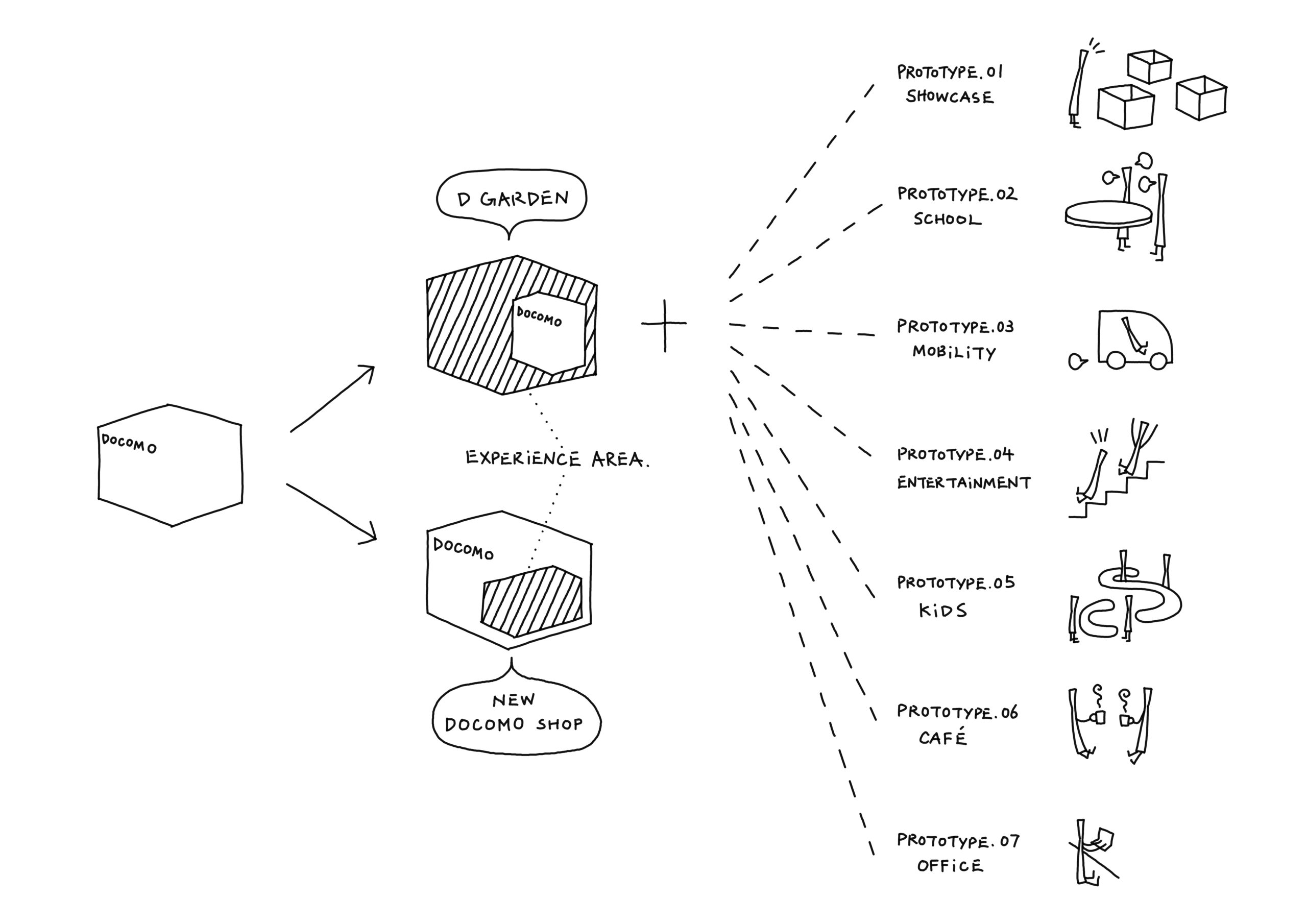
Accompanying these large-scale changes in service arrangements, were decisions to replace sections in the store with spaces focused on communication and experiences like smartphone workshops, new content trials, and after-sales support. To that end, two new types of storefronts have been developed.
The objective was to complement the new business model by organizing shops according to whether they exclusively serve docomo users, or they open their doors to everyone, including users of other mobile carriers.
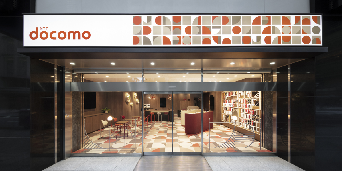
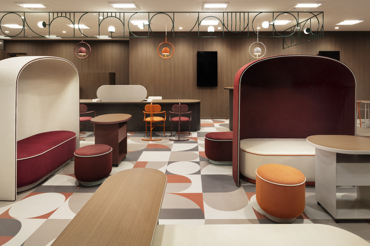
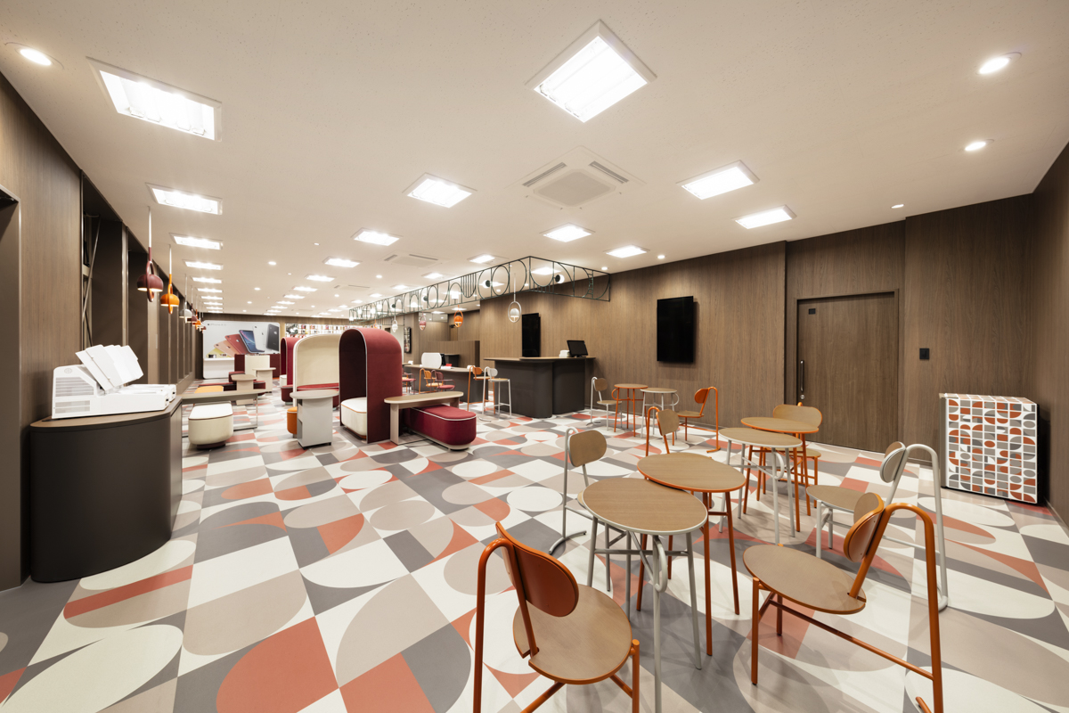
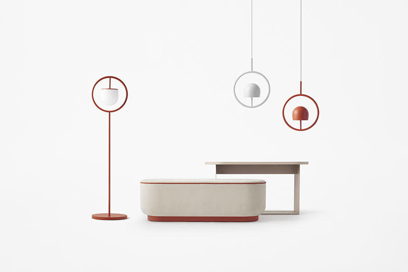
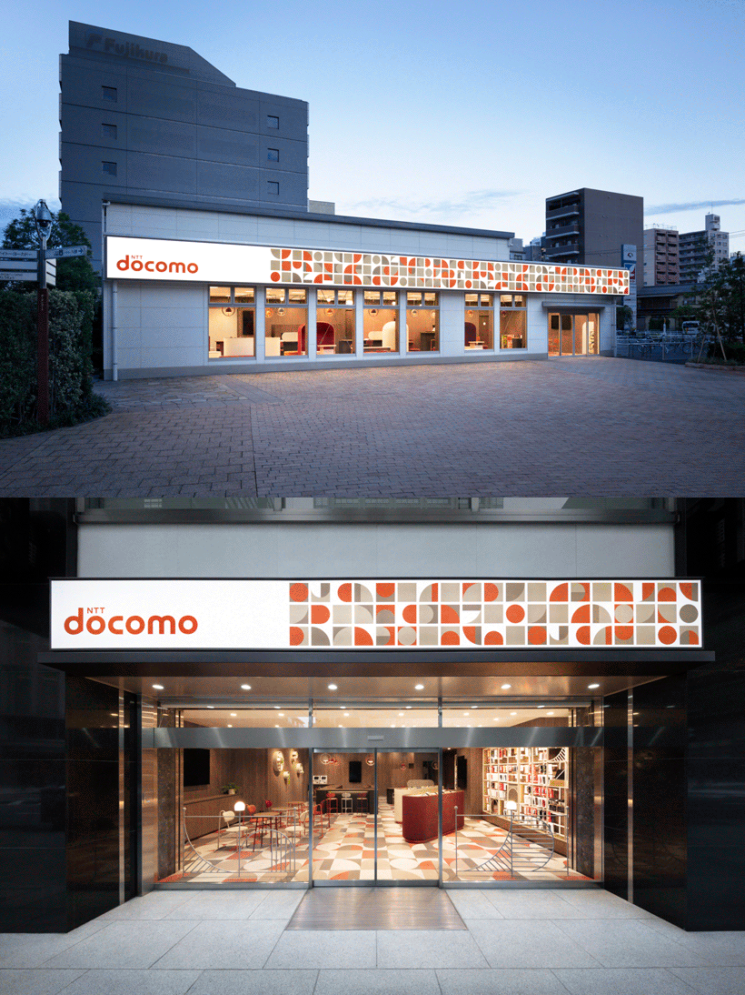
The first is the updated docomo shop, which will improve basic functions of the previous storefronts and introduce new communication- and experienced-focused content. To create a calming, tranquil space, the interior is arrayed in dark wood hues and warm grays, the distinctive red of the shop’s previous iteration, and warm lighting.
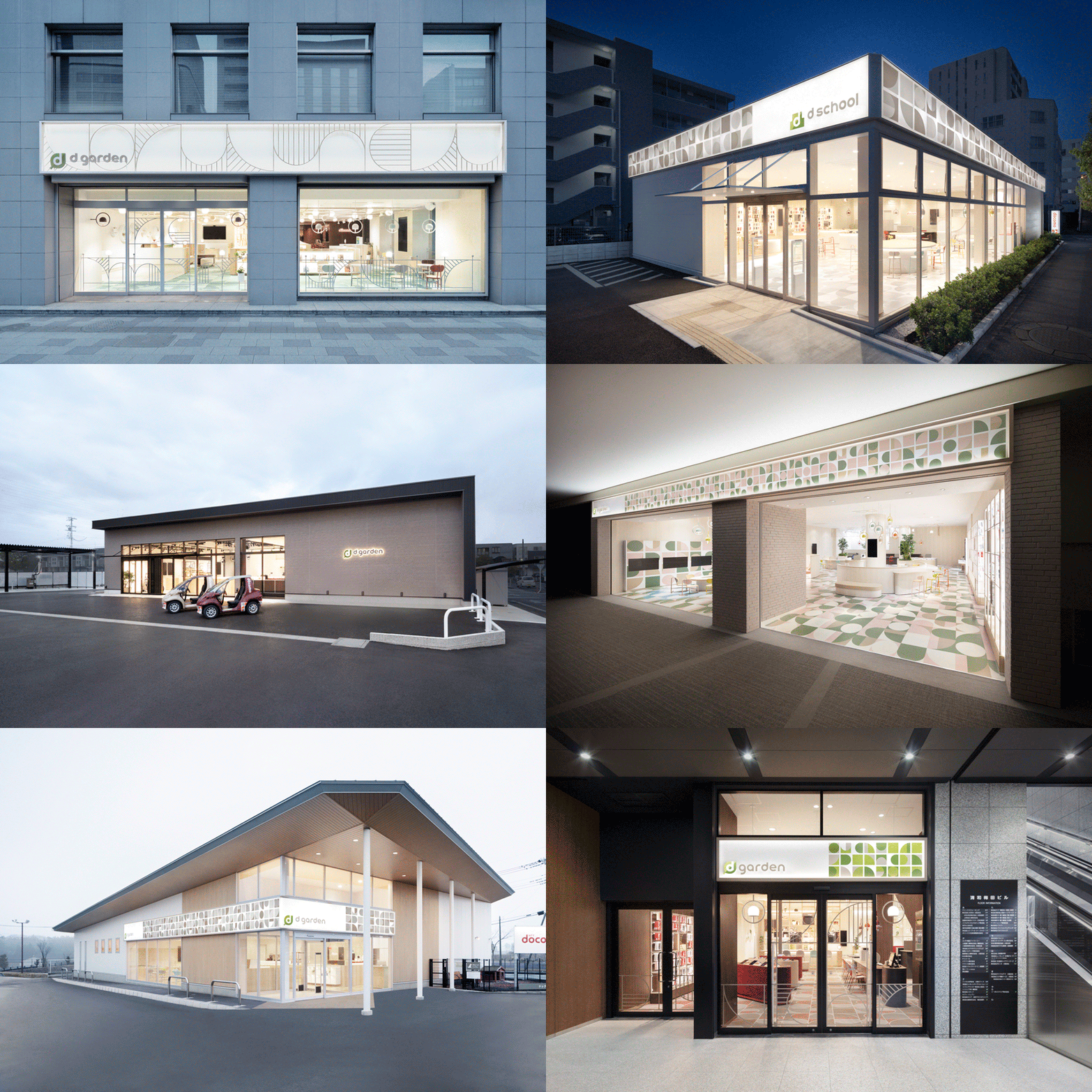
Meanwhile, “d garden” —the storefront that will welcome a greater number of people not excluding customers of other carriers—nests the functions of docomo shop in a space specializing in communication- and experience-focused content, like a shop within a shop.
Because the shop does not limit entry to docomo users and instead encourages anyone in want of assistance with smartphones to swing by, “docomo” was removed from the shop name, leaving only “d.” Its objective not being to sell products, the word “shop” was replaced with “garden,” in the image of parks and other such places open to anyone.
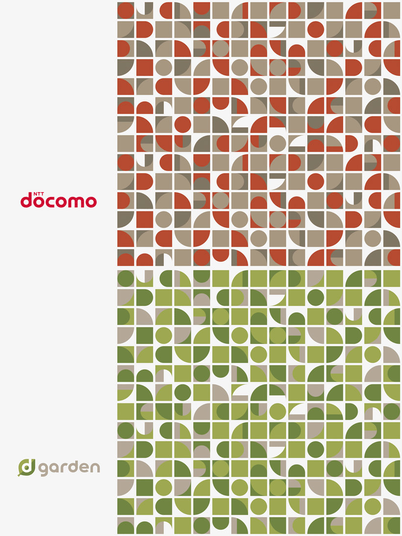
Green was used in graphical elements to complement the red and evoke the image of a park.
Natural wood and four soft colors were combined and a lighting plan mimicking natural light was adopted to create a bright, dynamic space.
Posters and other POP displays have gone digital, reducing visual noise in the shop and eliminating the hassle of swapping displays.
As for the style of customer service, the use of tablets makes various approaches to communication possible, not only at conventional service counters but also in lounges and café environments.
The in-store music is composed by music producer Seiji Kameda. Cozy, original background music, created in the image of weather—sunny, wet, windy, overcast, snow-covered—and also time of the day, enacts the atmosphere.
Comforts and functionality have improved for employees as well, with regard to the back of the house and their lockers, break areas, and storage areas.
To accommodate the considerable waves of activity and inactivity that shops experience, a hybrid space was prepared, to be used flexibly as
a private consultation space or staff workspace. Efficiency was improved within a limited space.
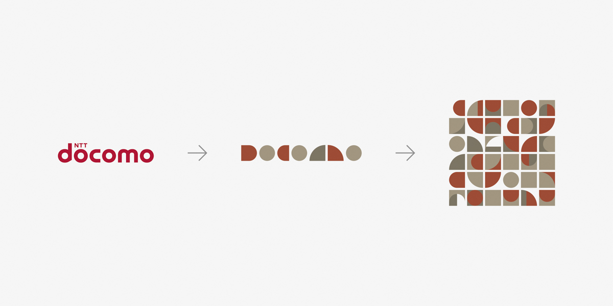
Graphic assets and patterns used in the interiors of both shops employ motifs developed from each letter in “docomo.” It was decided that this shared pattern, though with color variation, would give the sense of a unified docomo brand.
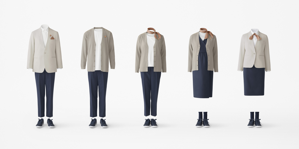
The former uniforms were replaced with casual and relaxed outfits intended to put customers at ease. Uniforms once lent only to women have been made androgynous with a variety of items such as T-shirt, cardigan, maternity, and pants style, not just the jacket style, so that men and women can freely coordinate different pieces. Materials were selected not only for being highly elastic and easy to move in, but also for maintainability, like being less prone to wrinkling and quicker to dry, making it easier for employees to work. Further, the change from pumps to sneakers is intended to reduce foot fatigue.
In developing this new design project, the team conducted design verification at prototype shops built based on various hypotheses.

