24 ISSEY MIYAKE
A new concept shop that offers a brightly coloured selection of items chosen from each of the Issey Miyake lines, alongside new, original items specially created for the shop. Each reasonably-priced item comes in 20 different colours, and the shop’s lineup is renewed every two months. The overall concept derived from the Japanese convenience store, with its constant state of dynamic, fluid change.
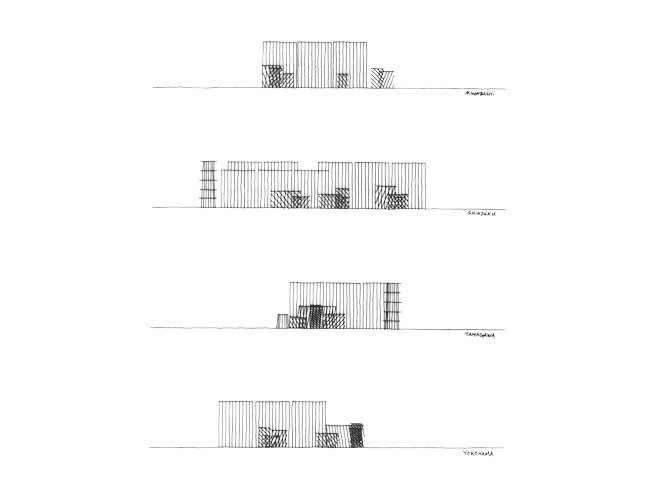
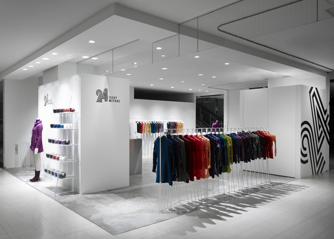
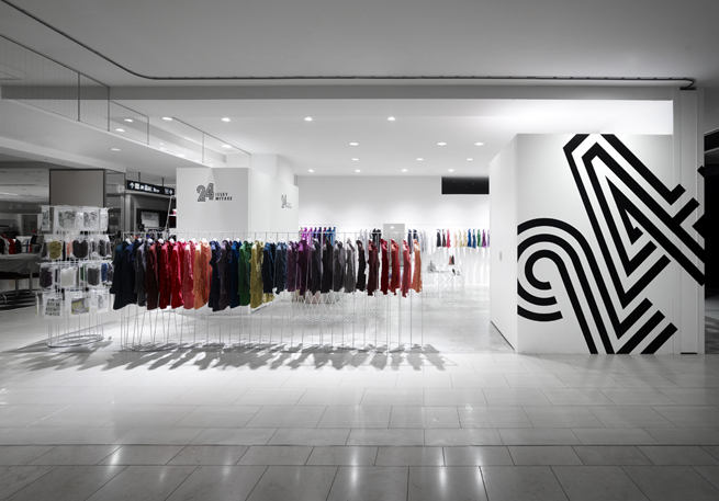
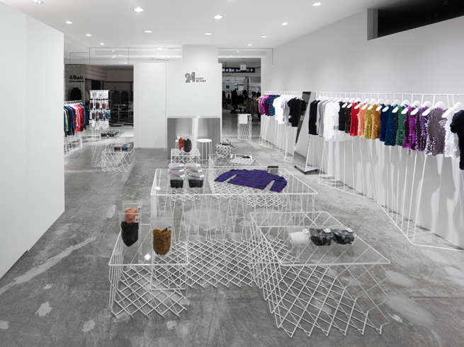
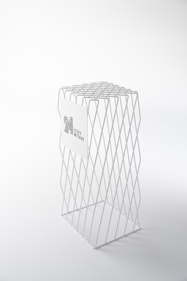
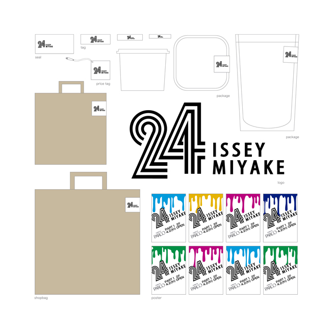
To highlight this association, the shop’s name is ’24’, and its logo features the kind of stripes you might expect to find on the facade of a convenience store. The packaging, too, comes from food packaging. For the shop design, we were inspired by the ‘harmonious chaos’ of Japanese convenience stores. To keep the space as small as possible and fill it to the brink with products, we got rid of the back room storage–all of the products are on the shelves at all times.
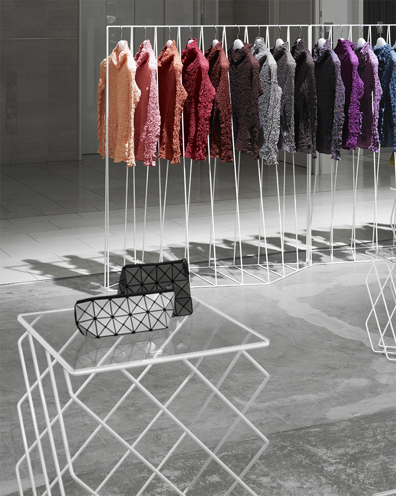
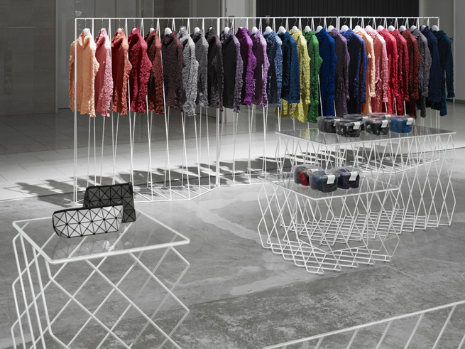
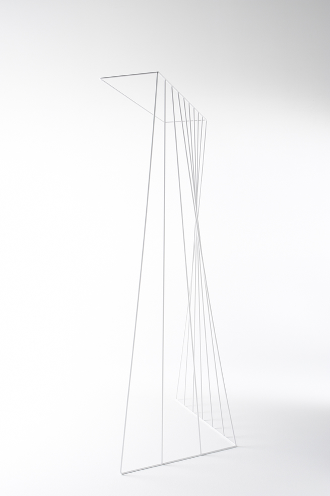
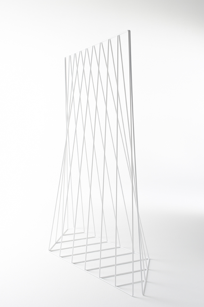
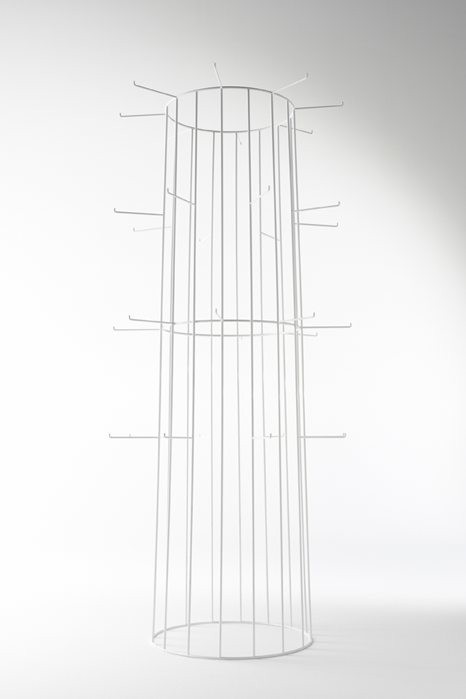
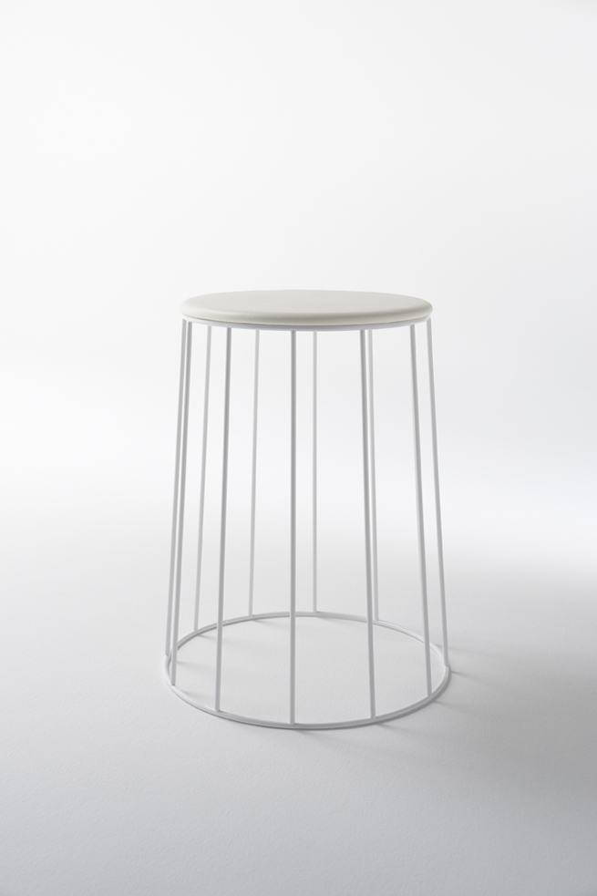
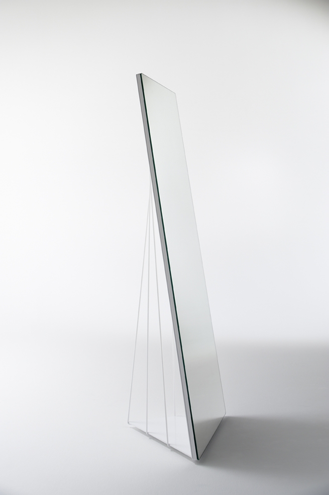
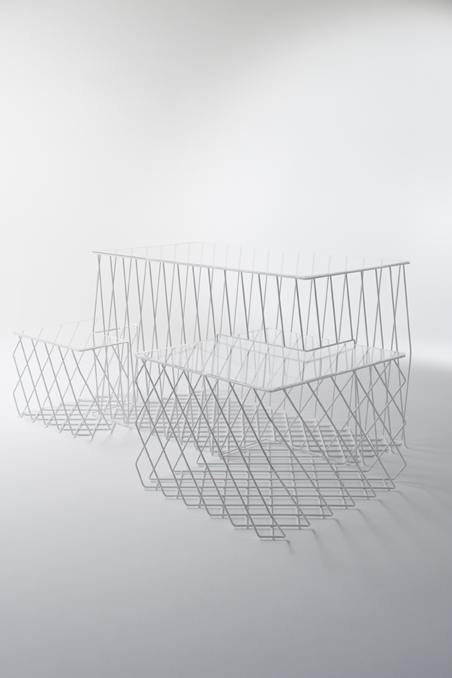
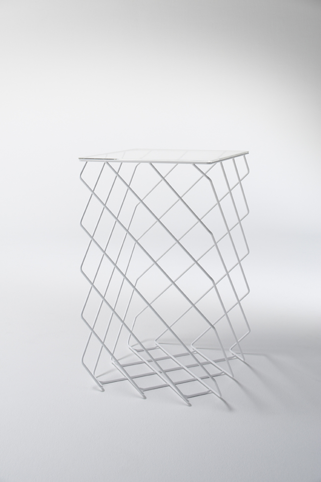
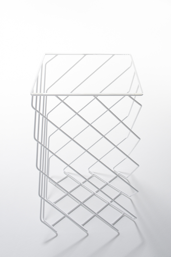
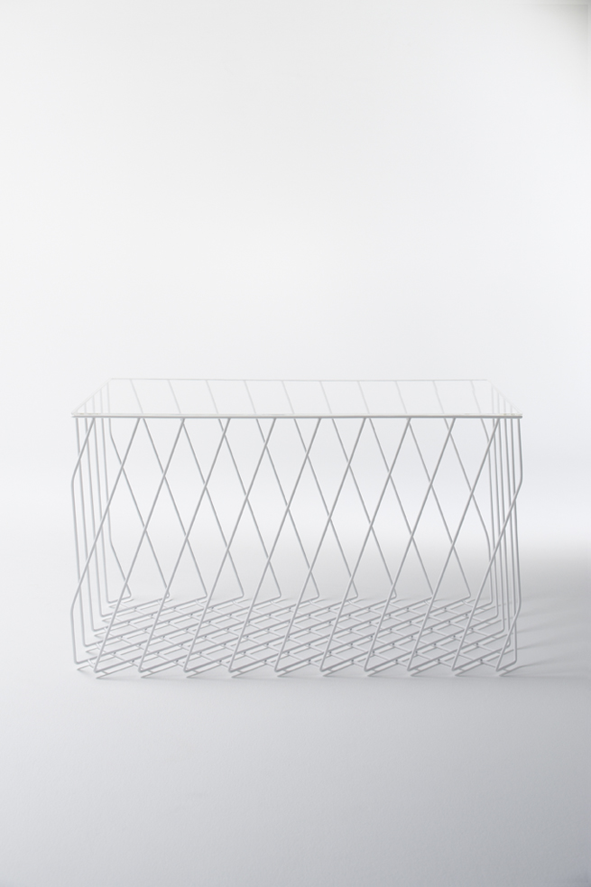
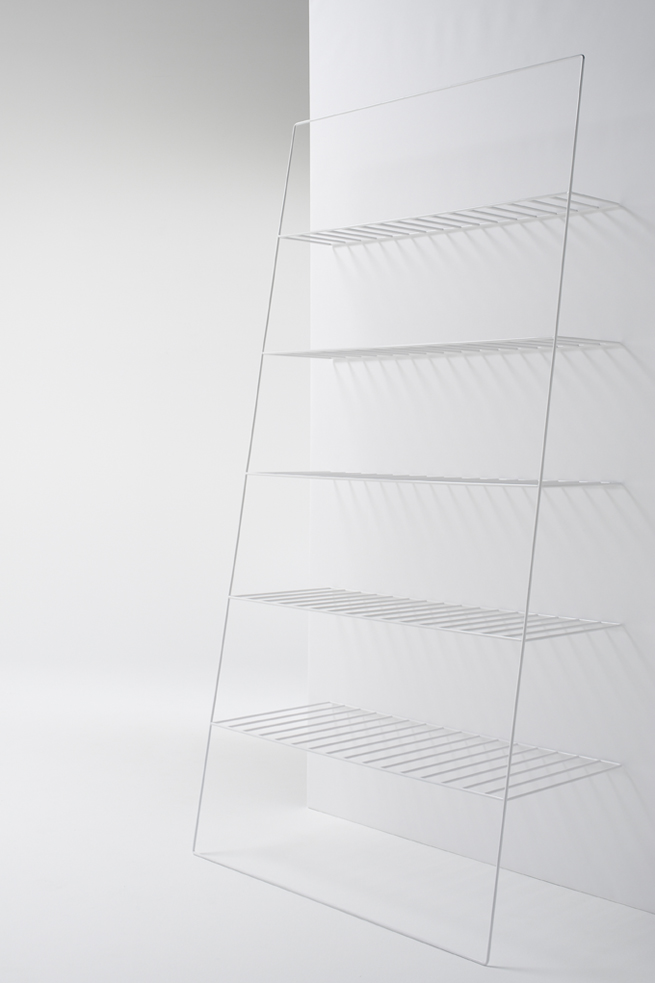
Since the products themselves are so brightly coloured, we used no colour whatsoever for the shop itself. All of the fixtures, including hangers and shelving, are 7mm steel, striped like a shopping basket. The entire shop functions as a display, and the white lines of the steel fixtures give the brightly coloured products a sense of volume. The idea is that as the items change, the shop itself will change character dramatically.
