space dipped shirts
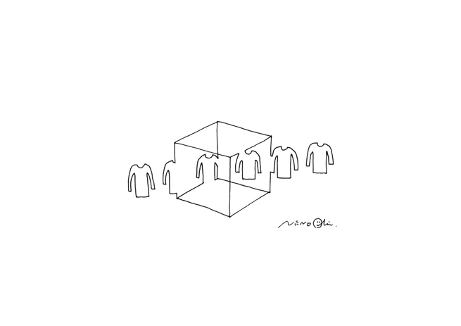
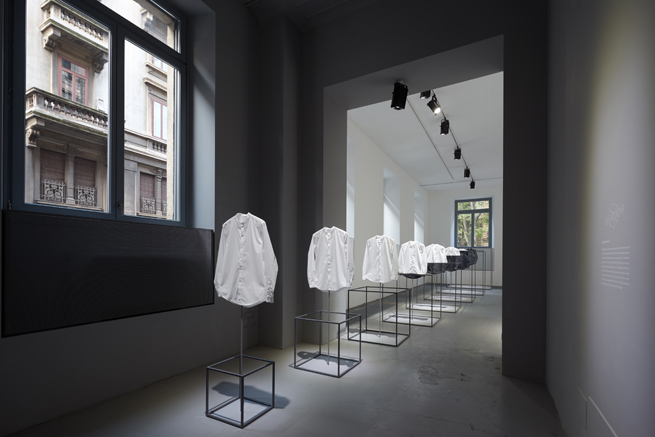
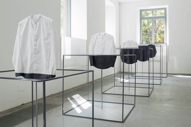
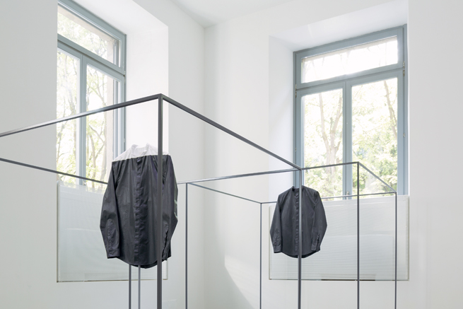
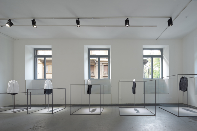
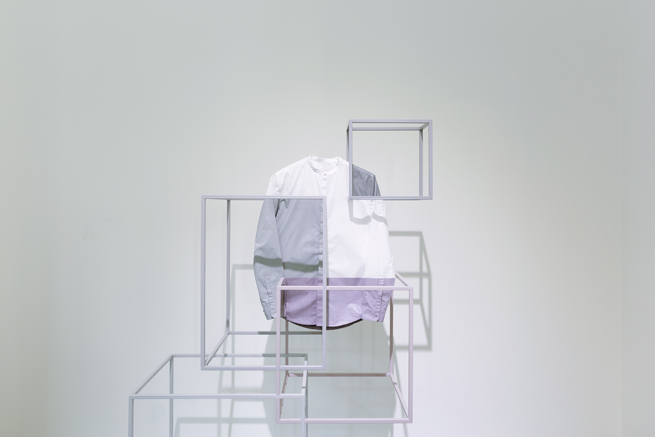
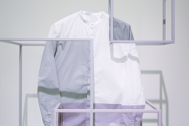
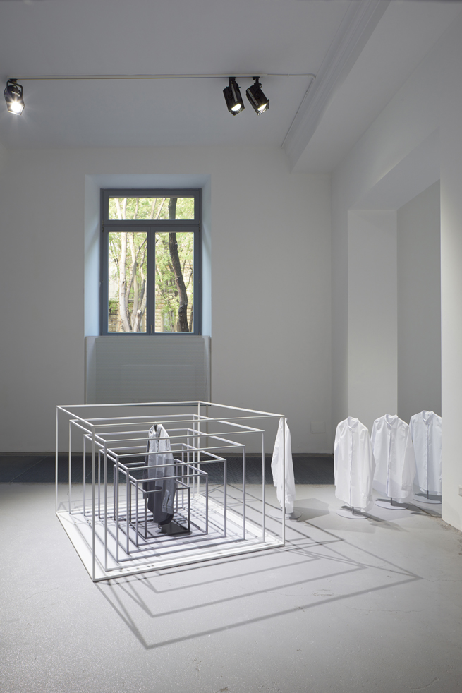
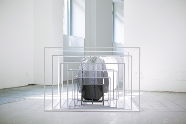
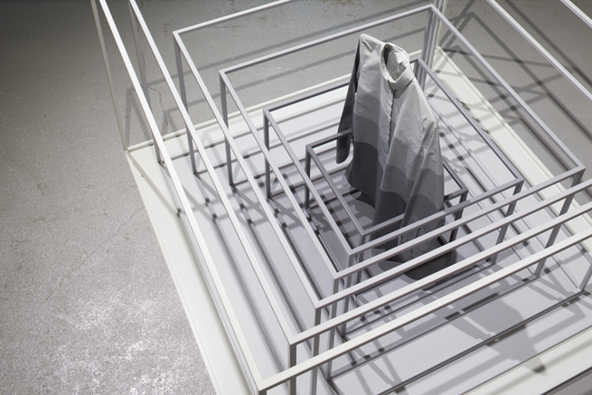
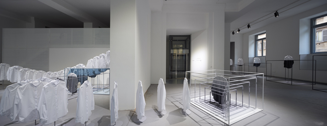
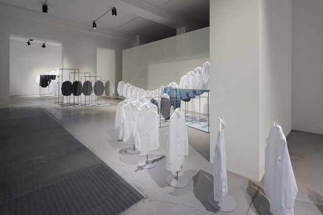
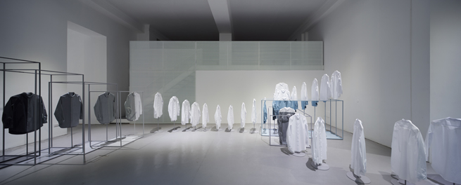
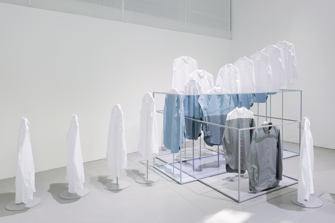
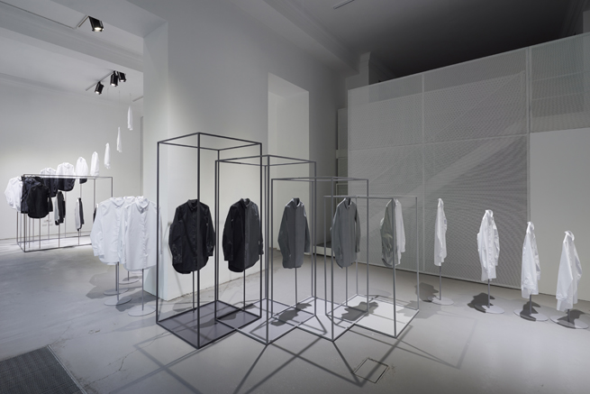
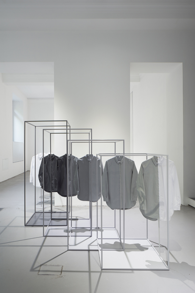
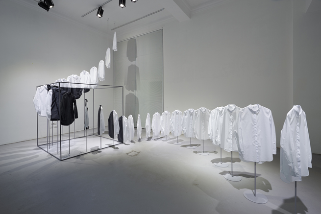
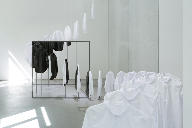
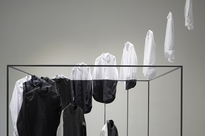
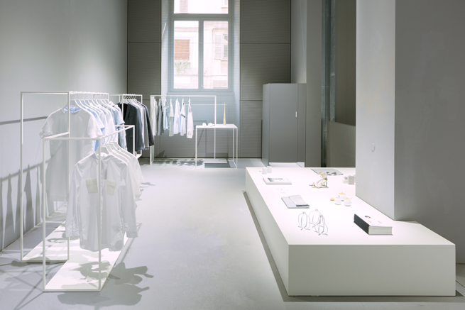
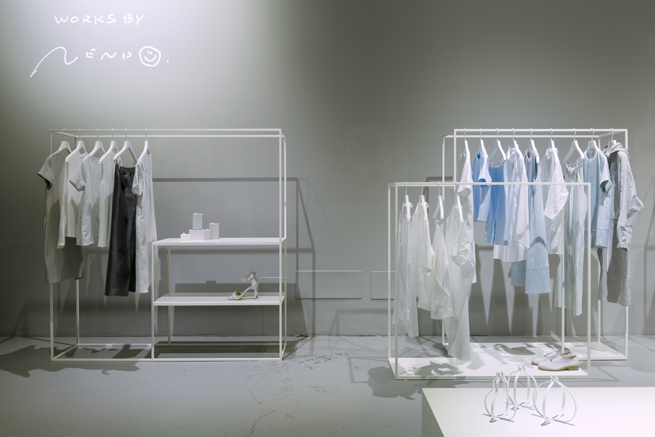
Sweden’s H&M Group launched fashion brand COS in 2007. The COS look combines simplicity with sophisticated details and carefully selected materials. One of the brand’s flagship products, the white shirt, starred in an installation at this year’s Milan Salone. We took an unusual approach for installation’s design: rather than designing the shirts or their hanger racks, we created sculptural pieces that rely on the interplay of shirts and frames. The smartly ordered shirts are crisp, classic white until they fall inside the steel cube frames, at which point they take on colour as thought the space itself has dyed them. This simple yet effective framing strengthens viewers’ awareness of the space.
