Shanghai Times Square
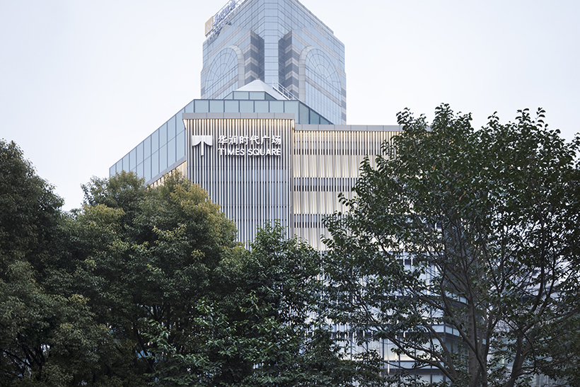
A renewal project of Shanghai Times Square, a commercial building in Pudong, Shanghai. With 2 basement levels, 9 floors aboveground, and a total area of approximately 53,200 square meters, the building is made to accommodate 170 tenants, including fashion brands, lifestyle shops, and various restaurants.
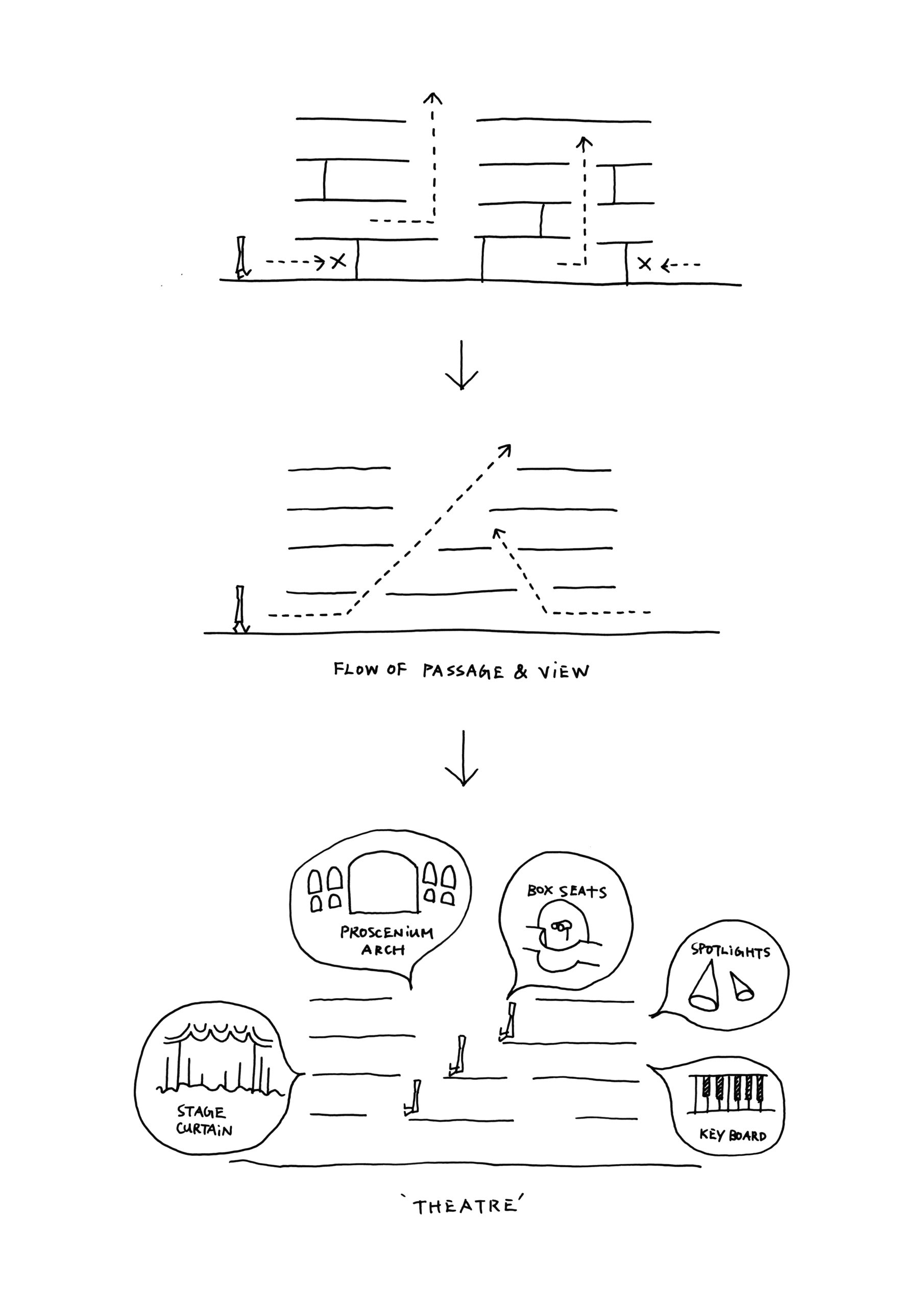
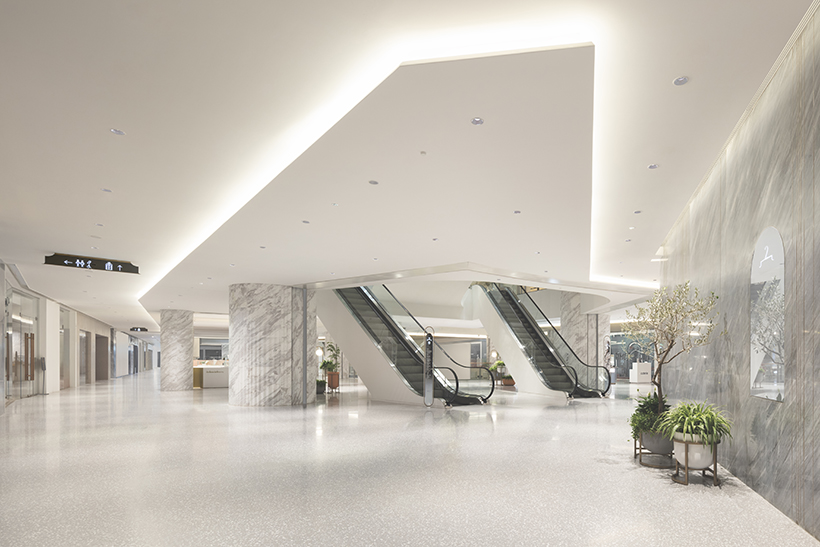
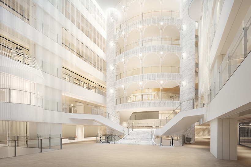
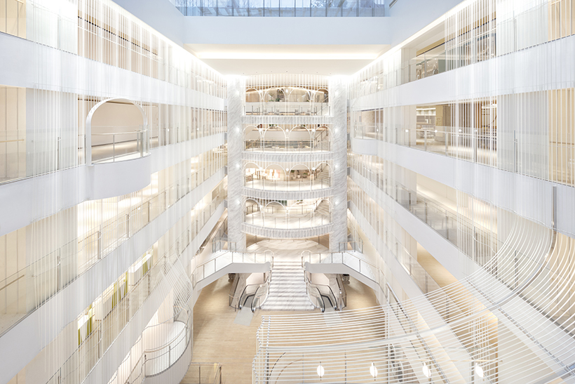
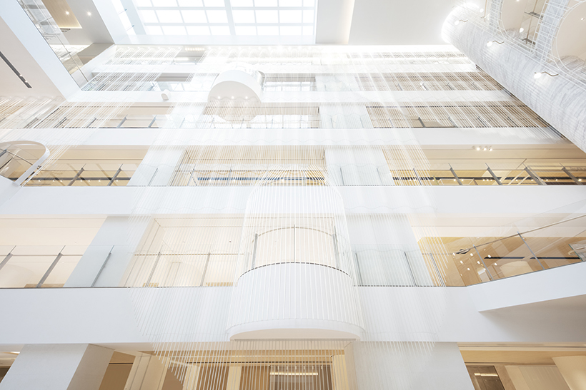
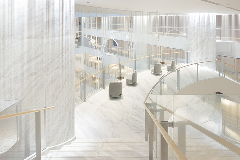
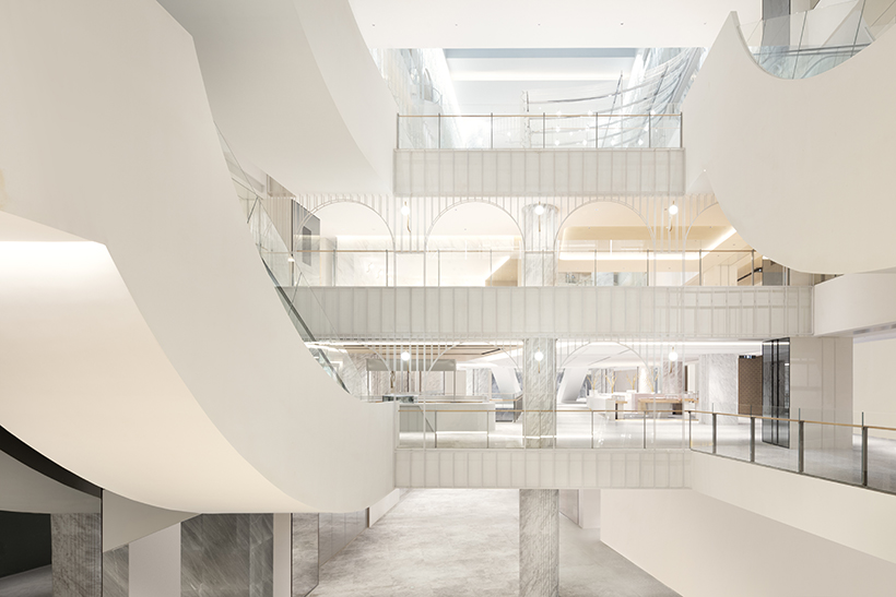
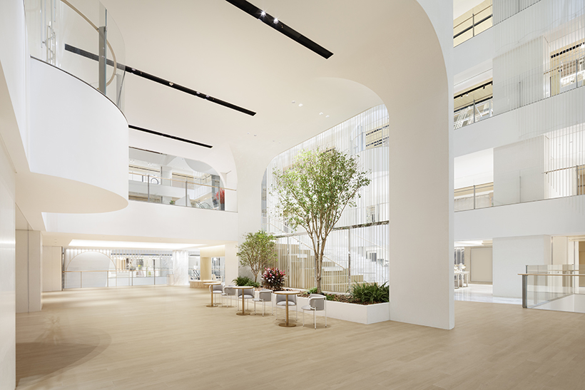
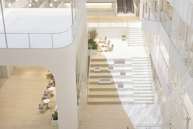
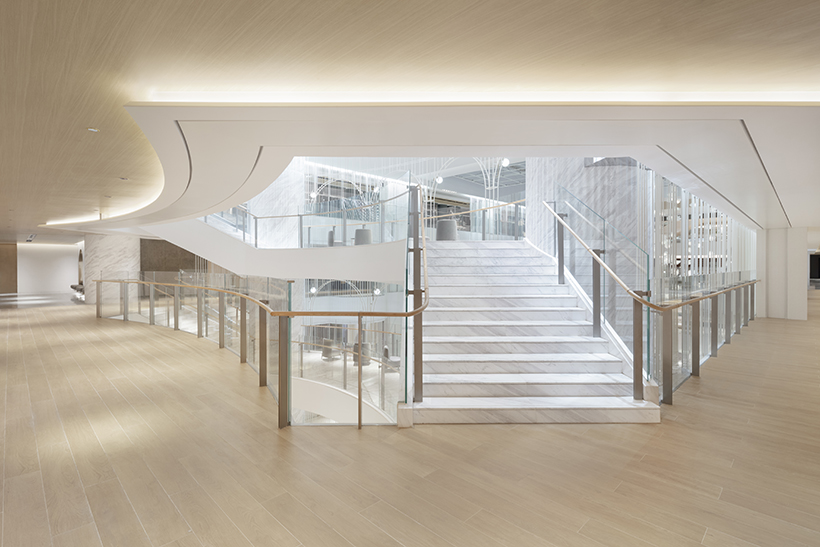
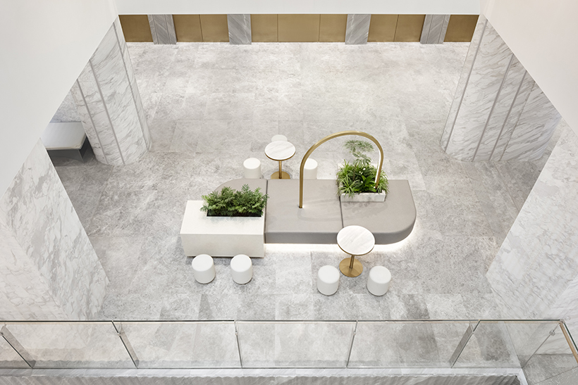
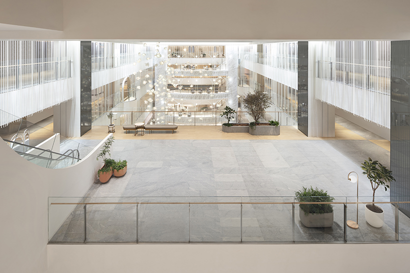
The existing structure had been much rebuilt and expanded upon, resulting in zigzagging traffic lines and exceedingly poor visibility through the building. While there were many atriums, their shape—reminiscent of wells—were not contributing to the sense of connection with the upper floors. And so first, we straightened the central passage on the ground floor to aid customers coming in from outside, while also relocating the escalators to secure circulation to upper floors for a smoother shopping experience. Then, the well-like atriums were rearranged to shift gradually, to unveil the view of the floors above the further one ventures by correlating the line of sight with the line of traffic, to create an environment that attracts shoppers to the upper floors.
Reorganizing these basic functions of a commercial facility resulted in a spatial configuration resembling a theater. The successive acts of passing through the ticket office and foyer, and then moving up to the upper floors to be greeted by a large theater, are extremely similar to the experiences found here. Theaters are also generally designed so viewers in any seat have a good view of the stage, and here too, the structure is deliberately tiered to draw the eye. The shopper plays the role of an audience, viewing numerous brands, products, and events, while simultaneously performing on the stage as part of the interior.
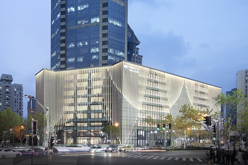
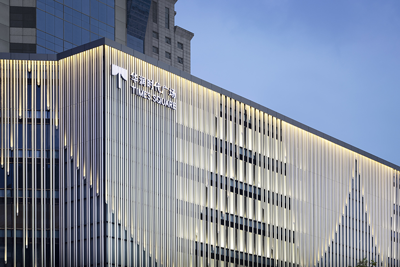
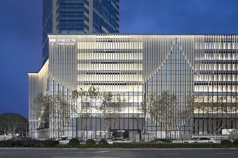
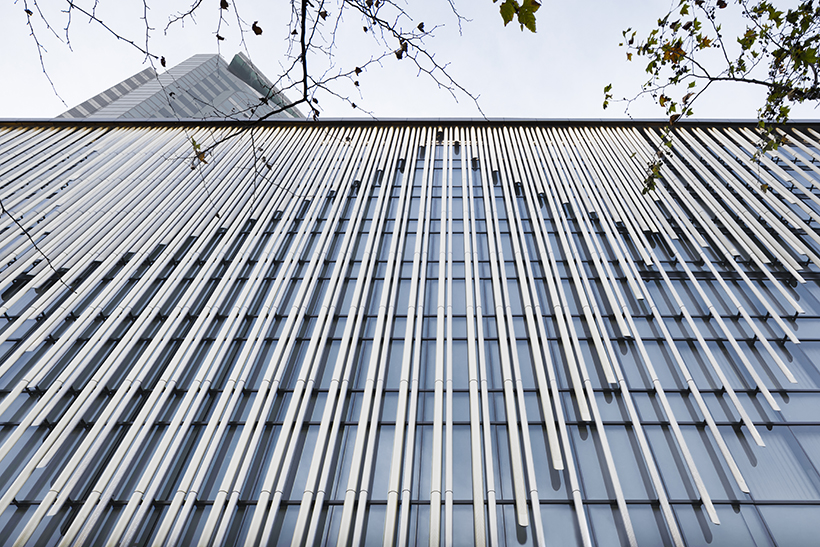
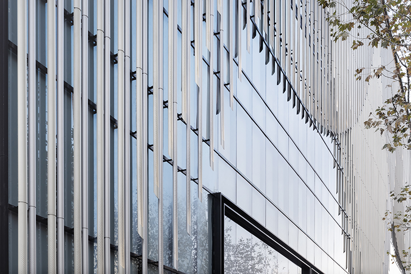
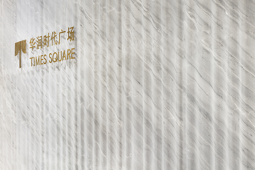
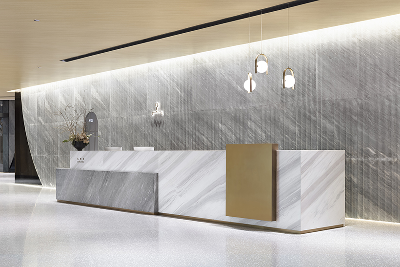
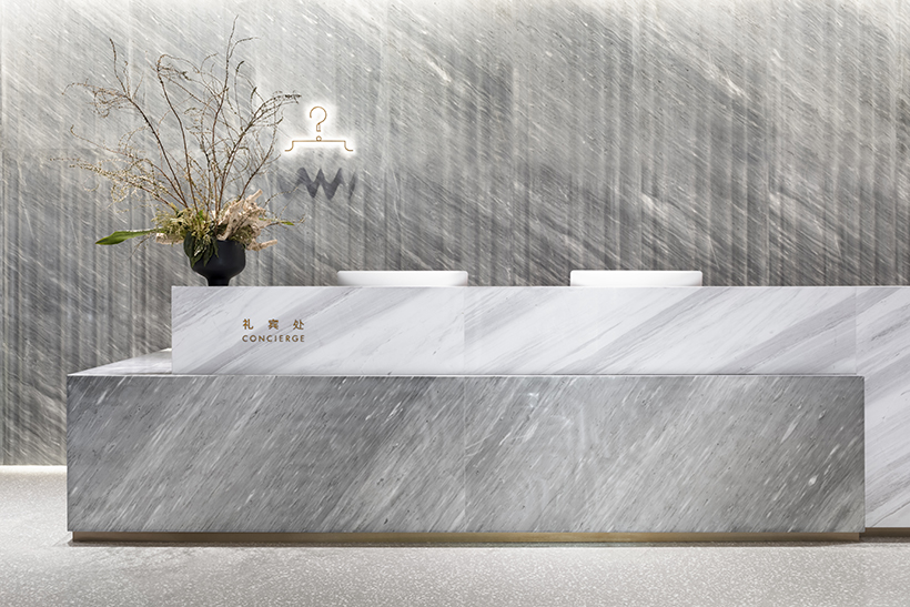
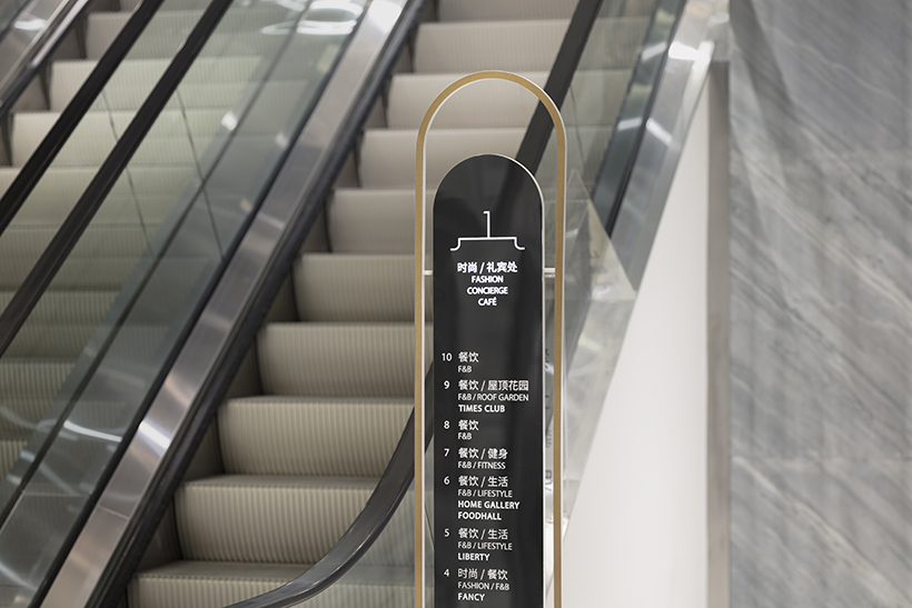
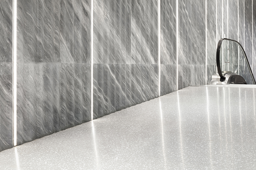
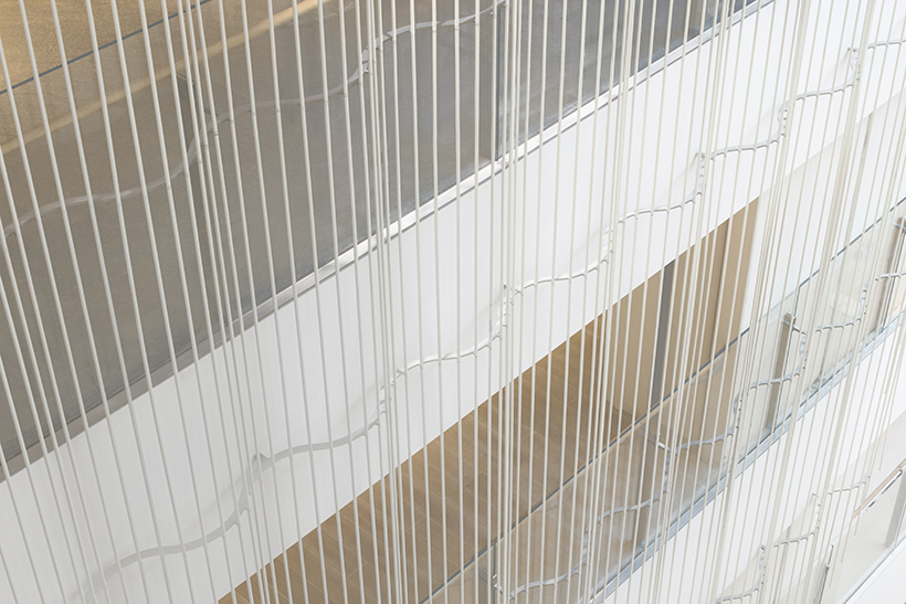
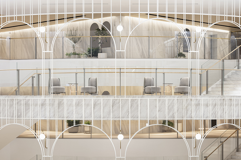
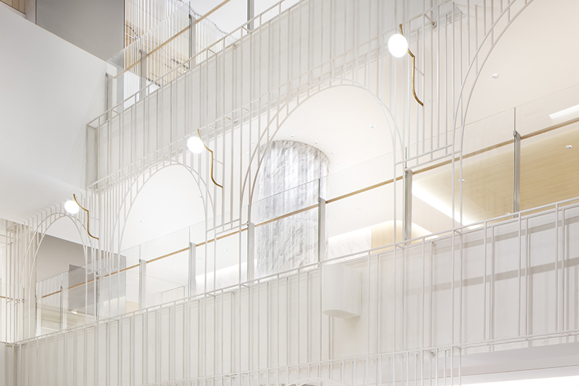
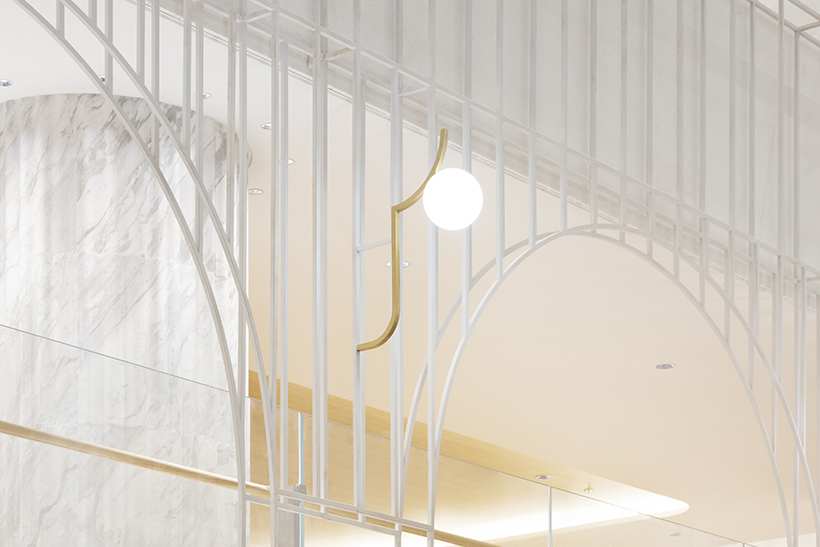
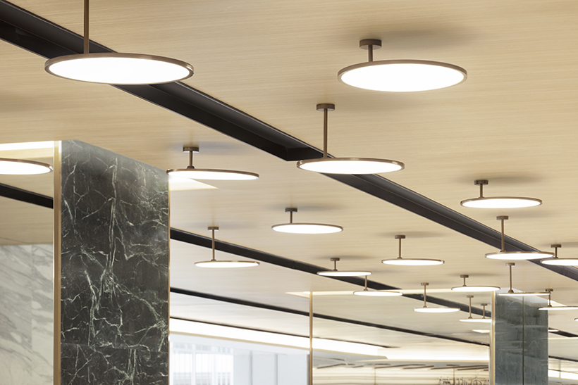
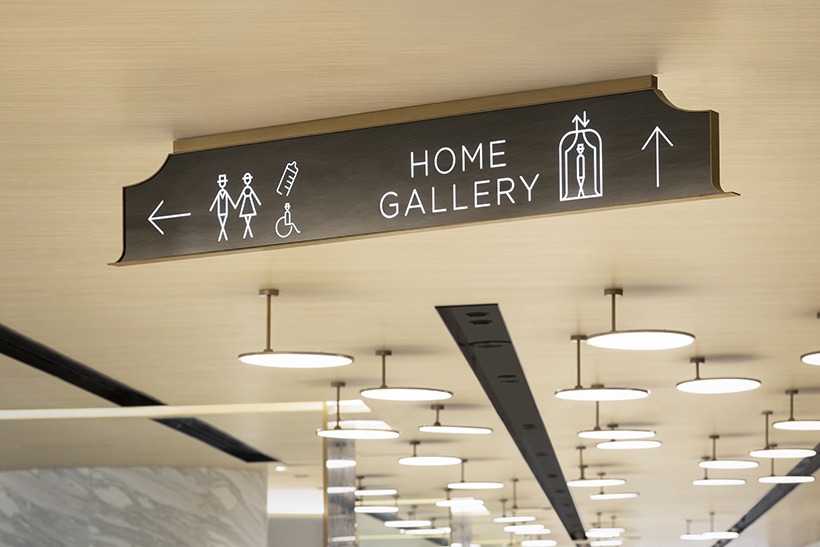
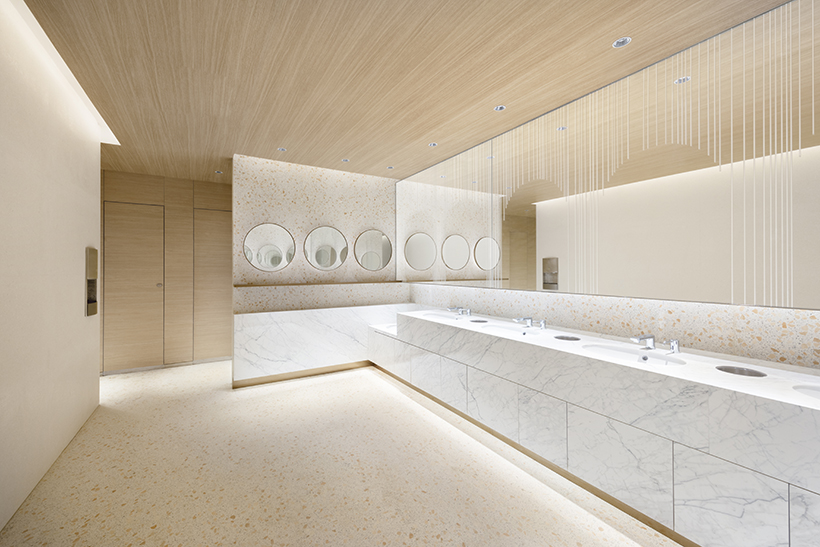
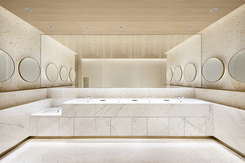
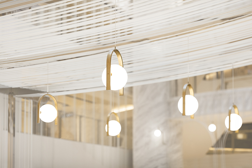
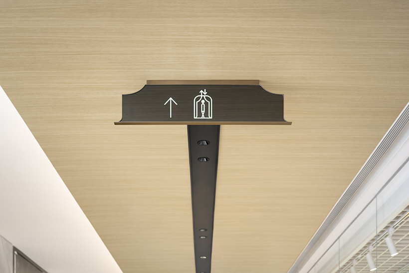
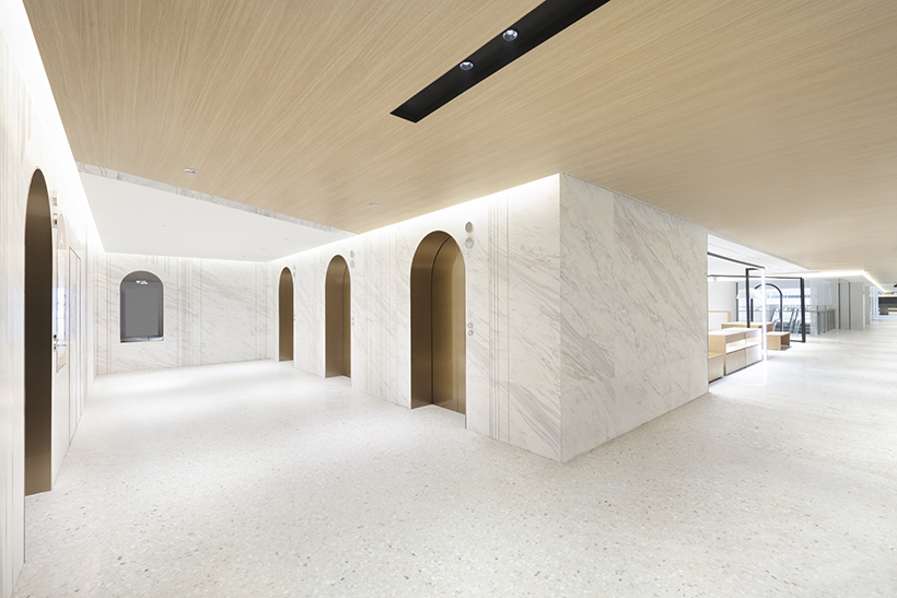
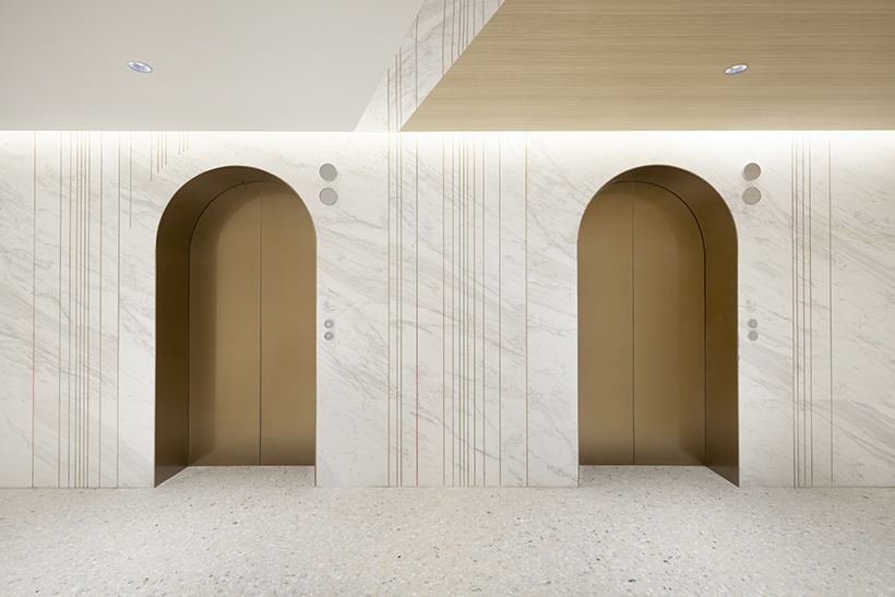
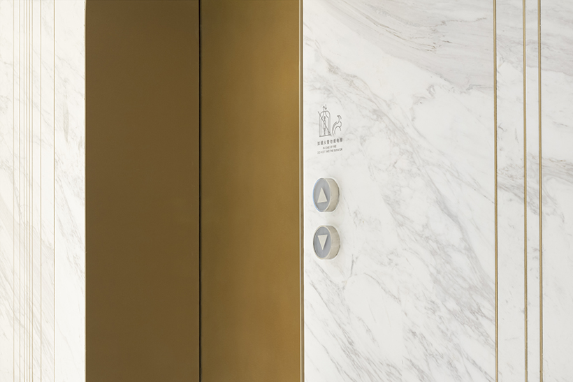
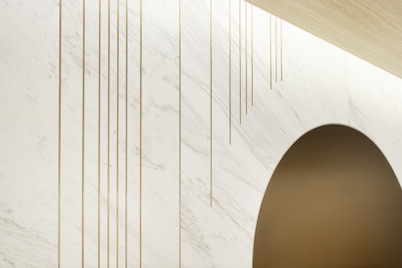
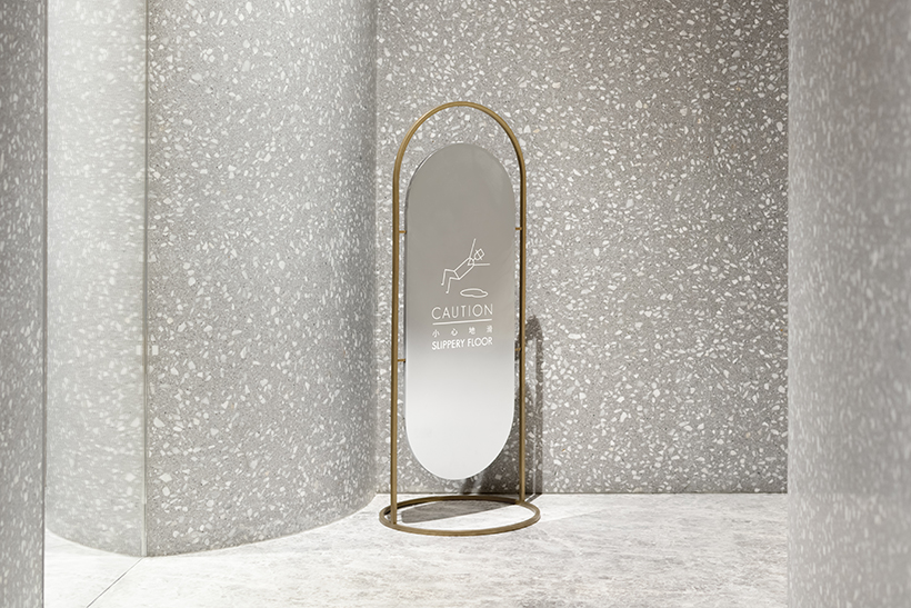
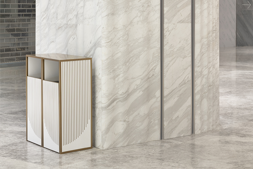
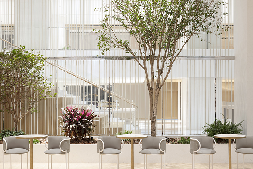
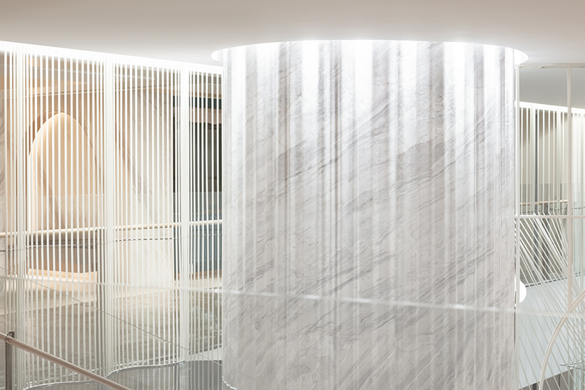
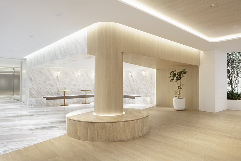
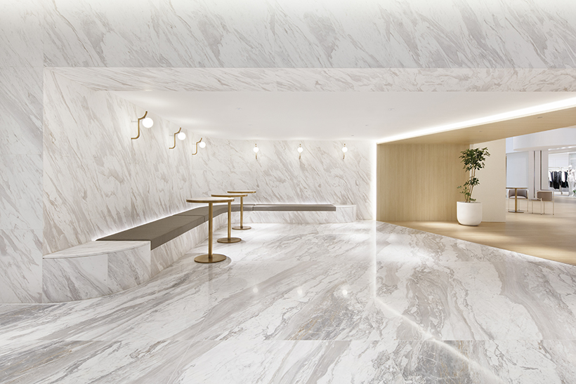
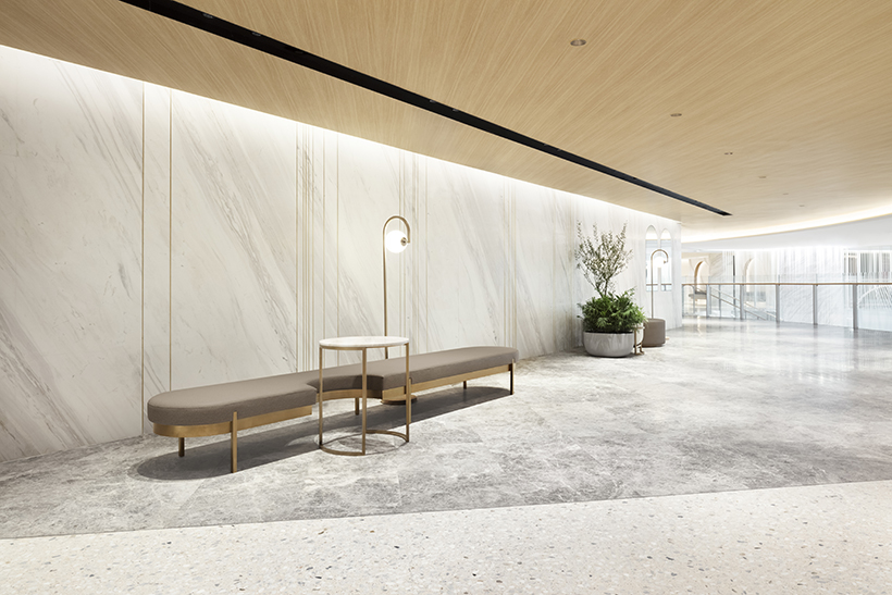
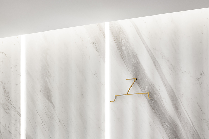
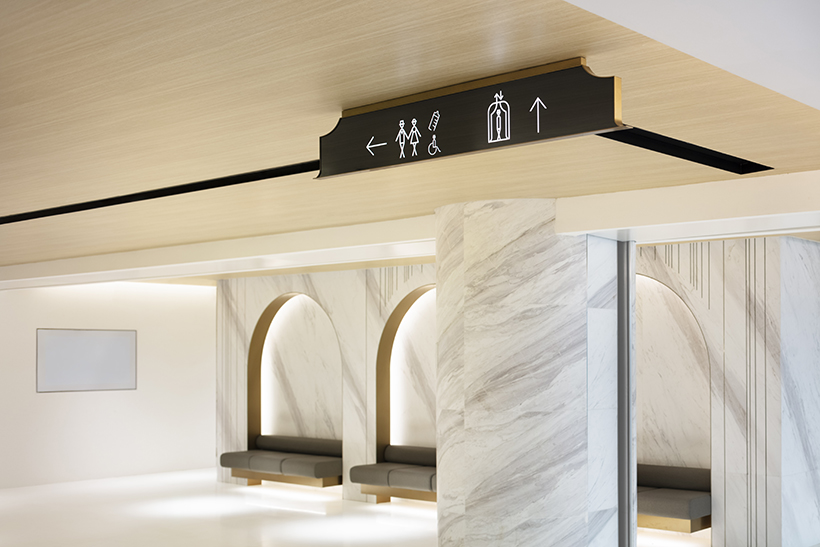
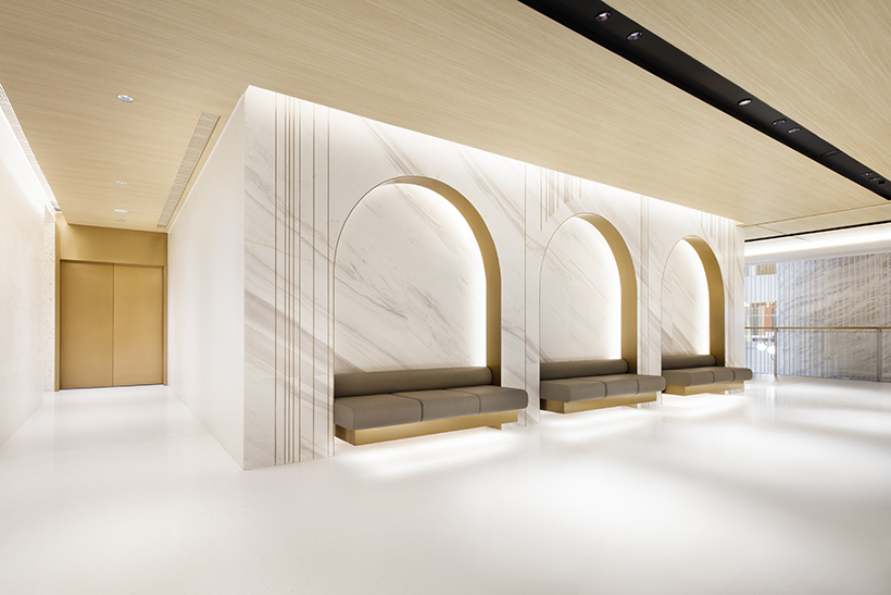
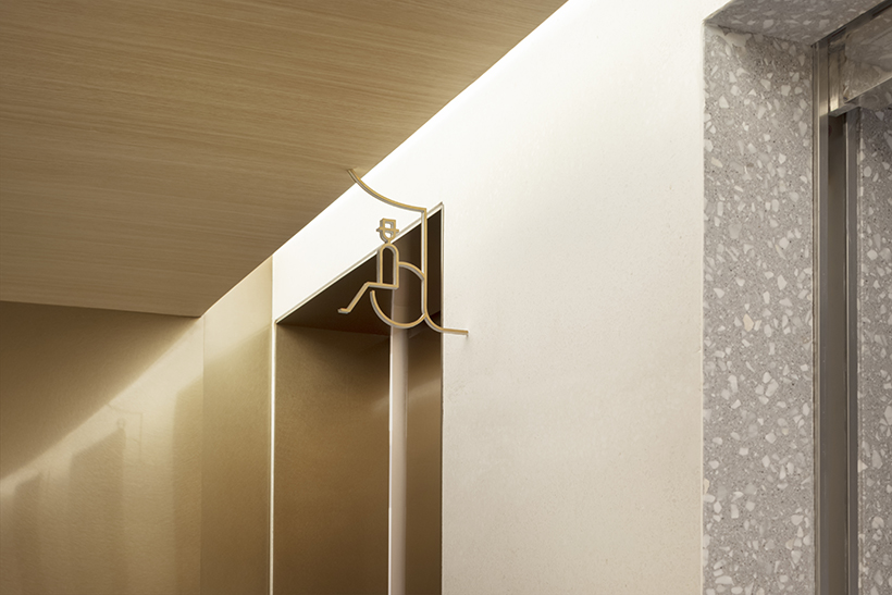
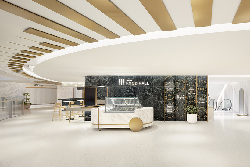
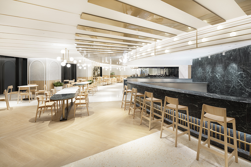
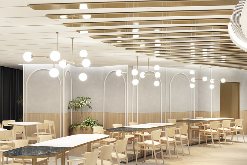
Screens made of aluminum pipes were inspired by stage curtains draping over the building façade and atrium. An image mirroring the draping design was also applied on the main pillars and stone wall finish. Further, we took the arch-shaped motif framing the front of a stage, the proscenium arch, and actively applied it to partitions, furniture, and even lighting in anticipation of an added softness and intimacy to the space. Box seating break areas protruding out to the atrium and a royal box-like VIP lounge were also added. From the food court evocative of a piano keyboard to a sundry shop floor with a spotlight motif, we filled the interior with multiple design elements reminiscent of a theater. Last but not least, the facility’s interior signage plan was designed imagining the parting of curtains as the performance begins.
