SHISEIDO THE STORE
The renovation project of the flagship store of Shiseido, the largest cosmetics company in Japan, started in 1872 as Japan’s first Western-style pharmacy in Ginza, Tokyo.
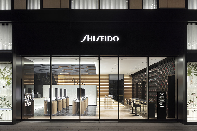
“SHISEIDO THE STORE ” has four floors, each serving various functions and services.Cosmetics are sold on the ground and 1st floors: products on the ground floor are aimed at foreign tourists,and the 1st floor also houses a skin care salon.
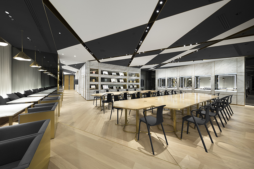
There is a photo studio and a hair and make-up salon on the 2nd floor, and on the 3rd floor there is a cafe, event space and private booths for beauty consultations.
The main concept of the interior design was to integrate the common elements of interior construction and makeup. When preparing a wall or floor, first you apply the undercoat, then layers of paint or buffing, and finally a protective topcoat.
Make-up follows a similar order.
First you apply skincare, then primer and foundation for the base, then touches of color such as lipstick or eye shadow.
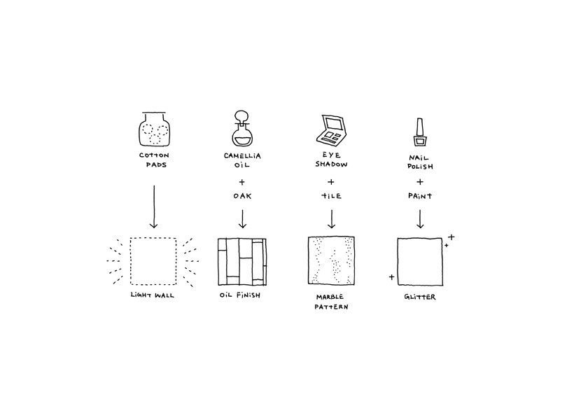
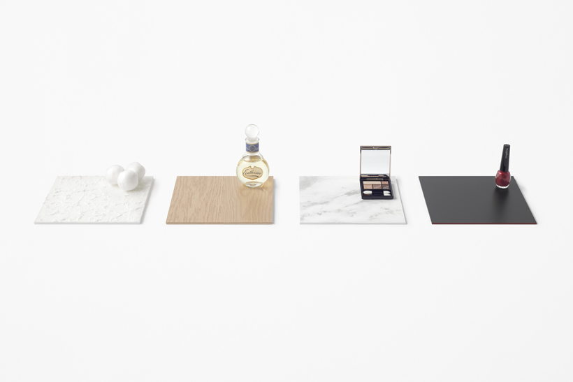
These similarities in process inspired the concept of renovating the space to apply make-up to the store’s interior using Shiseido products and related materials.
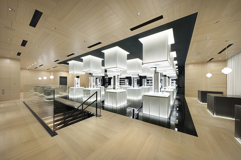
Paper made from thinly spread cotton pads was used on the walls; lit from underneath, it gives off a soft glow.
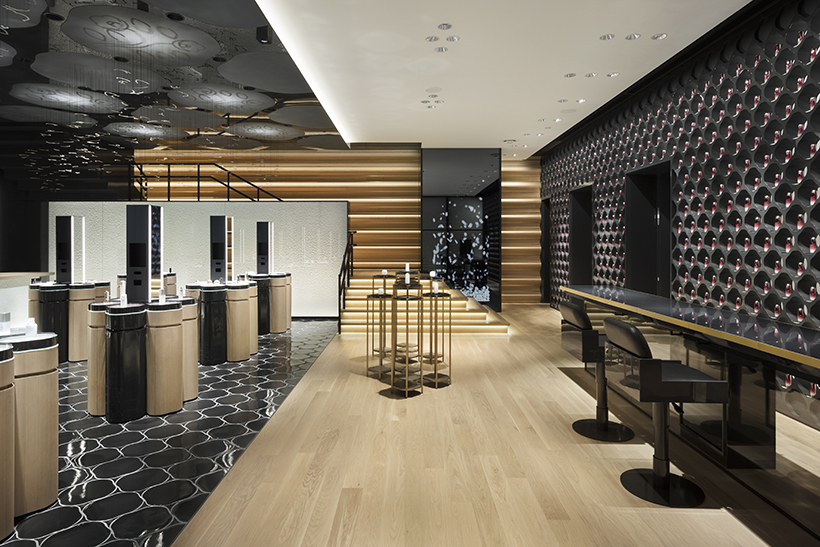
Camellia oil—a key ingredient at Shiseido, especially in its hair care products—was applied to natural, unprocessed wood, to give it a beautiful aged finish as time passes.
Eye shadow was layered onto the walls with make-up brushes to give a marble-like finish, and nail polish was mixed into the paint used for the ceiling art, giving a subtle shimmer that catches the shifting light.
Hidden touches like these have their roots in the Japanese sense of beauty and are a fitting expression of Shiseido’s perspective.
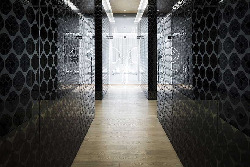
The design motif has been derived from a silhouette of the camellia flower, Shiseido’s icon since 1915.
Forms of the motif, each inspired by techniques from Japan’s traditional crafts, can be found throughout the space: it appears in the form of columns, resembling sections of bamboo; as cut-outs in the style of kiri-e paper craft; in woven patterns resembling traditional baskets; and modeled like traditional papier-mâché hariko.
Finally, string curtains were used behind the windows of the building. A traditional decorative knot called awajimusubi, was tied at specific points on the strings to form the outline of a camellia flower when viewed from afar. The awajimusubi knot is a traditional Japanese symbol which stands for a long-lasting bond and connection, representing Shiseido’s desire to build an enduring relationship with its customers.

