light & shadow
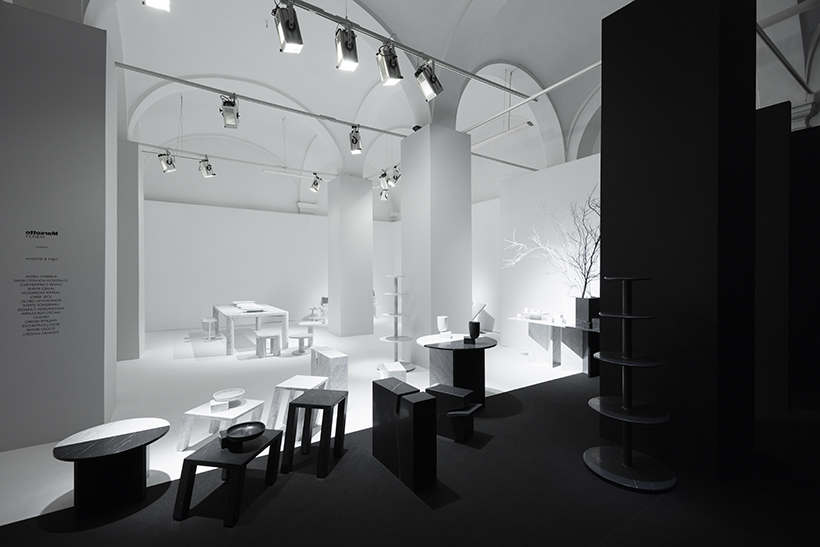
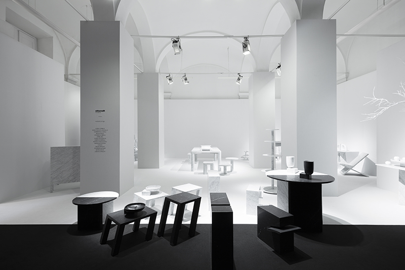
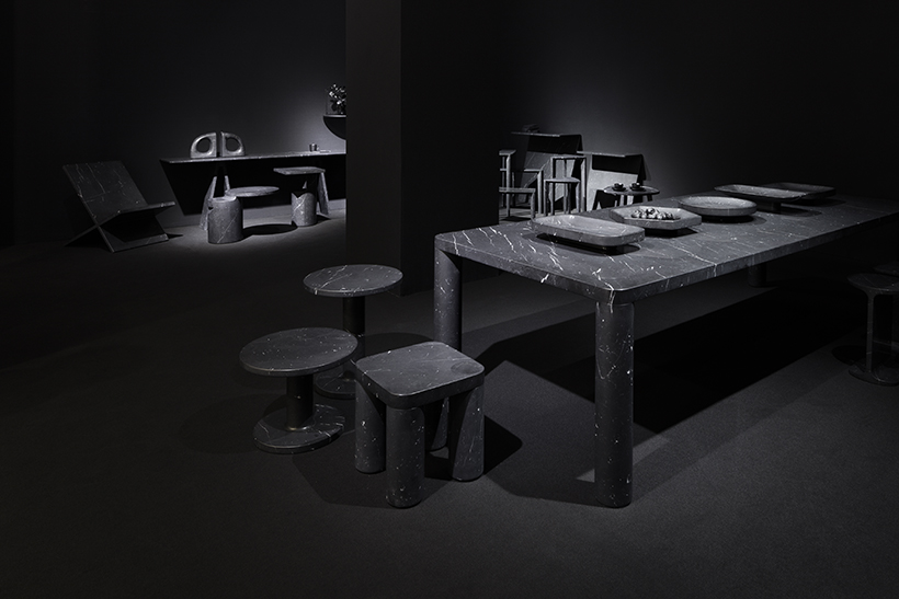
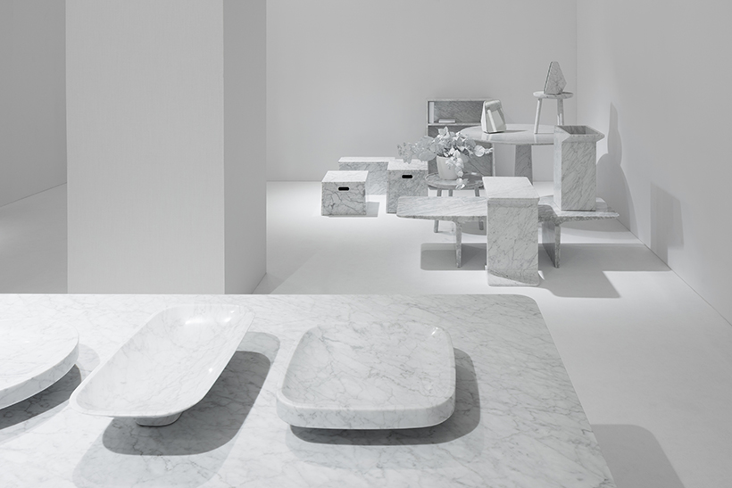
A design for Marsotto edizioni’s exhibition space held at the “Spazio Bigli“ during the Milan Design Week 2016.
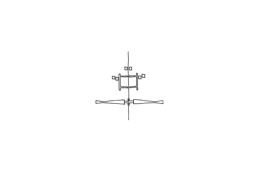
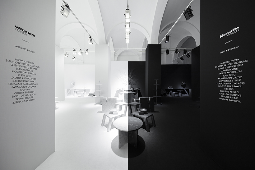
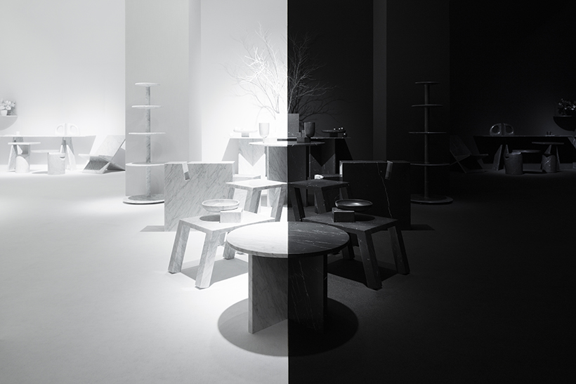
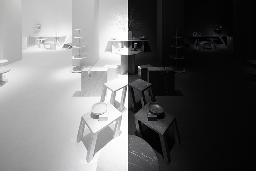
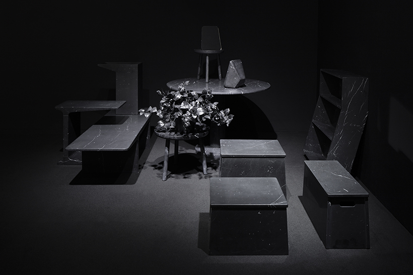
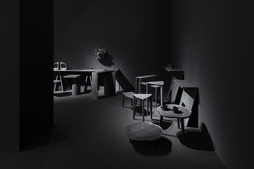
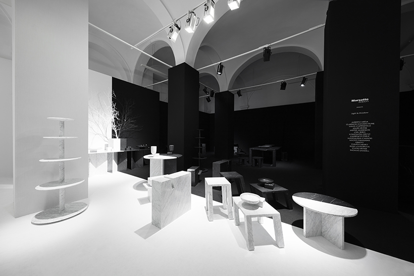
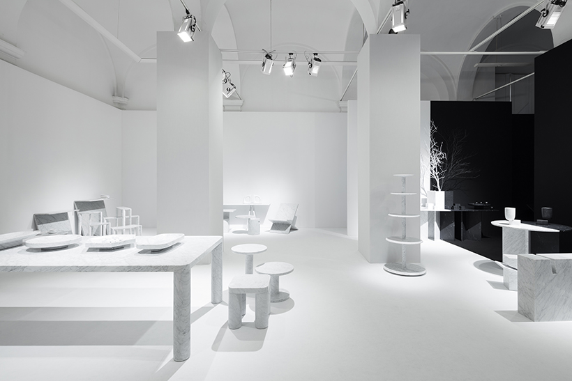
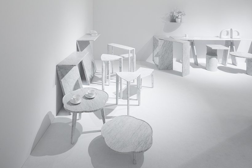
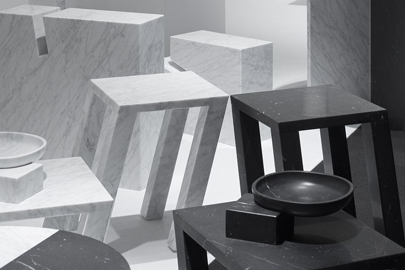
First, attention was paid to the fact that that the company specializes in marble furniture, and that all of their products were made from a single material in either “black” or “white”, without combining any other materials.Then, in order to utilize the rather unsightly regularly spaced pillars and the spatial feature of the entrance being in the middle of the space, it was decided that the exhibition space would be divided right and left using “black” and “white”. Furniture was arranged in a complete symmetrical manner in each space, so that as soon as one enters the room they are standing right at the boundary of the spaces.
A visual effect was created as though the spaces were reflecting each other like a mirror, along with the pillars that were rhythmically arranged.
