JAPAN: Tradition. Innovation.
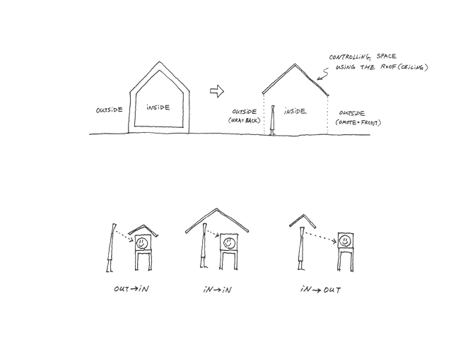
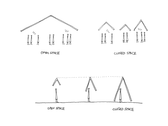
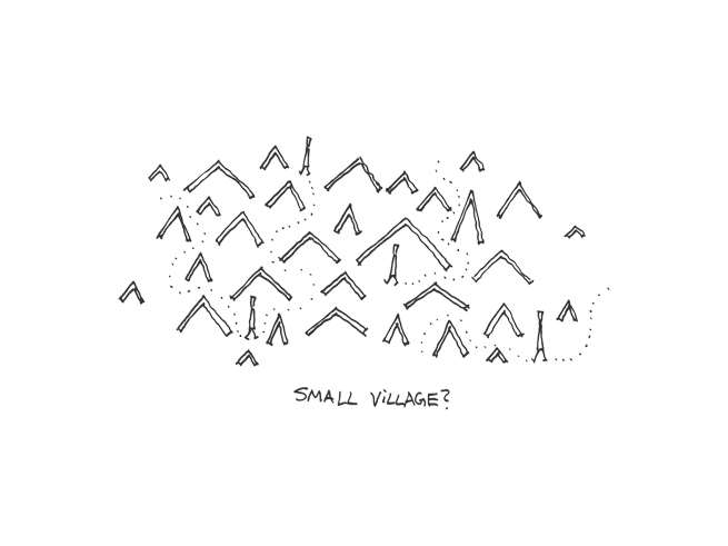
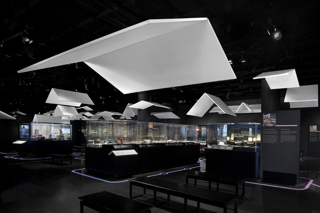
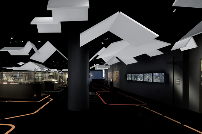
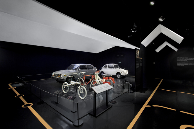
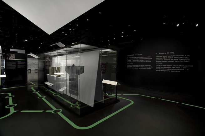
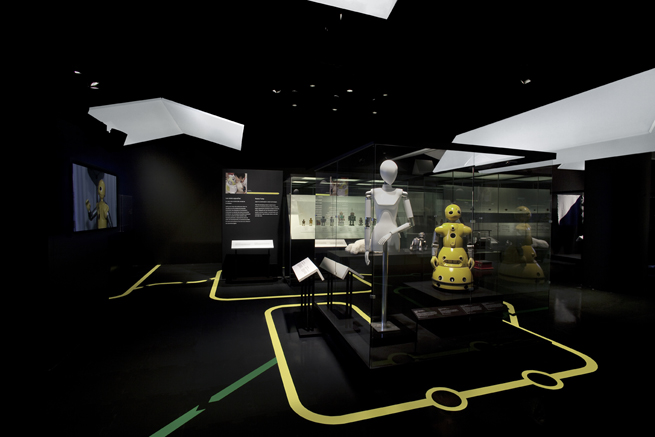
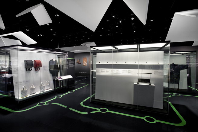
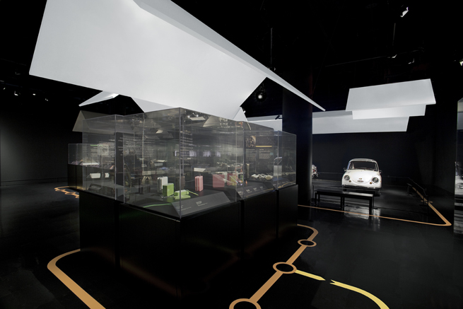
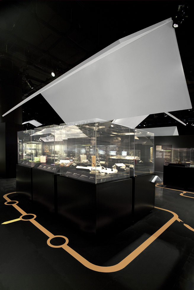
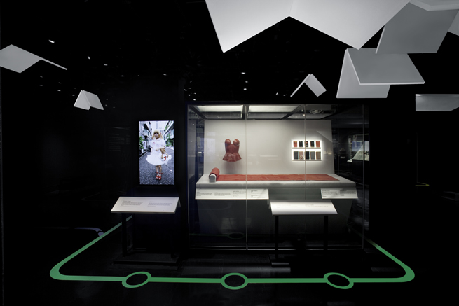
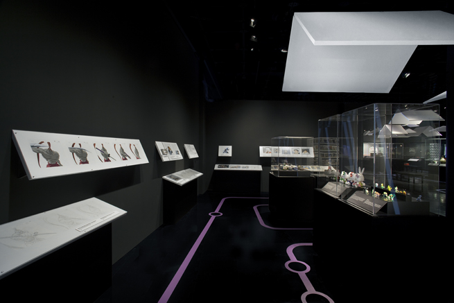
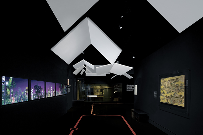
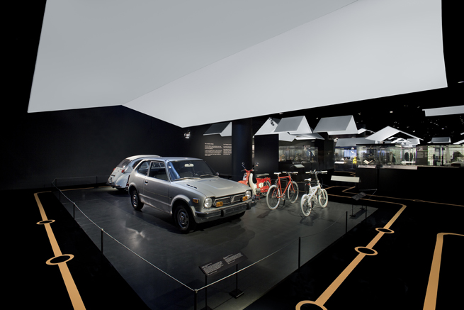
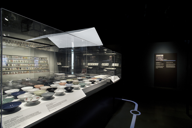
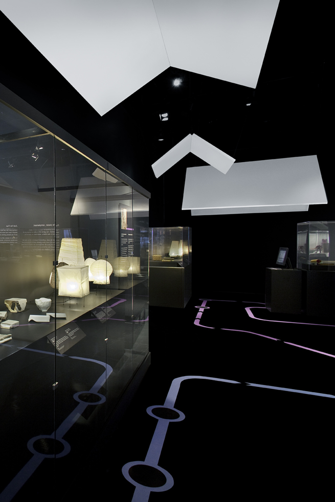
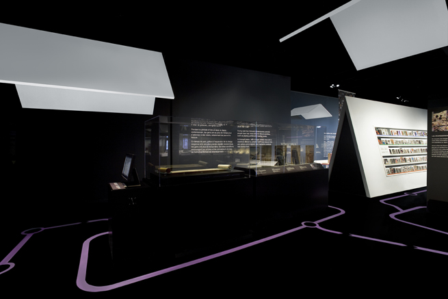
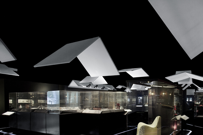
The exhibition design for the ‘Japan: Tradition. Innovation’ exhibition at the Canadian Museum of Civilization. The exhibition, which is divided into five sections devoted respectively to transportation, robotic technology, social status, consumer culture and play, uses a comparison between contemporary and Edo Period(1615-1868) Japan to explore and interpret the relationship between Japanese culture and design. Given the massive 970m2 space, we decided to use ‘roofs’ in a variety of sizes and heights to demarcate the different exhibits, rather than constructing temporary interior walls. A subway map-like graphic on the floor allows visitors to identify the different zones. Areas under larger, lower roofs are ‘closed’ spaces, and the light that falls between the many smaller roofs like sunbeams filtering through leaves creates a ‘half-outdoor’ space. Visitors look out into ‘outside spaces’ from underneath the roofs and -conversely- peer back into ‘inside spaces’, producing a hybrid, effervescently-changing space in which the relationship between inside and outside can never be known for sure. At first glance, clearly-defined lines of movement seem to have disappeared, and objects to be jumbled about in no visible order, but in actual fact, the space is subtly, carefully divided using the invisible space-defining practices of ‘ma’ and ‘shikiri’, which have existed in Japan since ancient times. The result: the massive space loses its homogeneity, and provides visitors with the chaotic spatial experience of Japanese urban space.
